Did you know neutrals sell fastest when textures add depth? You’ll layer tactile fabrics, from linen to cotton, then pair them with wall finishes, rugs, and varied weaves to keep the palette calm yet dimensional. You’ll balance wood, stone, and metal in matte or brushed finishes, with lighting that subtly highlights each surface. Keep the space cohesive and serene, and you’ll understand why texture is the quiet driver—but the key ideas are just ahead.
Why Texture Elevates Neutral Interiors
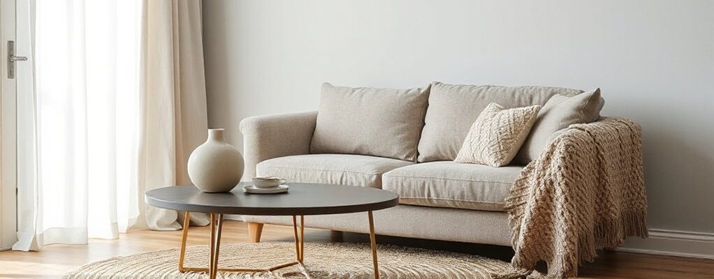
Texture brings neutral interiors to life by adding depth and tactility. When you introduce texture, you transform flat spaces into inviting environments that read as curated, not clinical. Textural contrast creates visual interest without color shifts, so you retain the serenity of a neutral palette while adding dimension. You’ll notice how woven fabrics, chipped finishes, and rougher surfaces catch light differently, guiding your eye through the room with subtle emphasis. Tactile engagement invites you to touch and feel the surfaces, anchoring your sense of place and comfort. The result is a calm, sophisticated rhythm where pattern and material work in harmony. Minimal color, maximal texture—that balance defines elevated neutral interiors.
Layer Fabrics to Create Cozy Calm
Layer several fabrics to cultivate a cozy, calm mood without clutter. Layering textiles blends warmth with restraint, guiding the eye and softening lines. Begin with a neutral base: smooth cotton or linen, then introduce tactile textures to enrich depth. Use varied weaves to catch light differently, avoiding busy patterns that clash. Incorporate textured wall treatments nearby to extend the calm, tactile narrative without visual overload. Practice deliberate swatch layering by handling each fabric, ensuring cohesion through subtle undertones.
- Choose a dominant neutral, then add two supporting textures
- Align color temperature across textiles for harmony
- Introduce a single accent with a contrasting but muted hue
- Use fabric swatch layering to preview combinations before committing
How to Mix Wood, Metal, and Stone for Balance
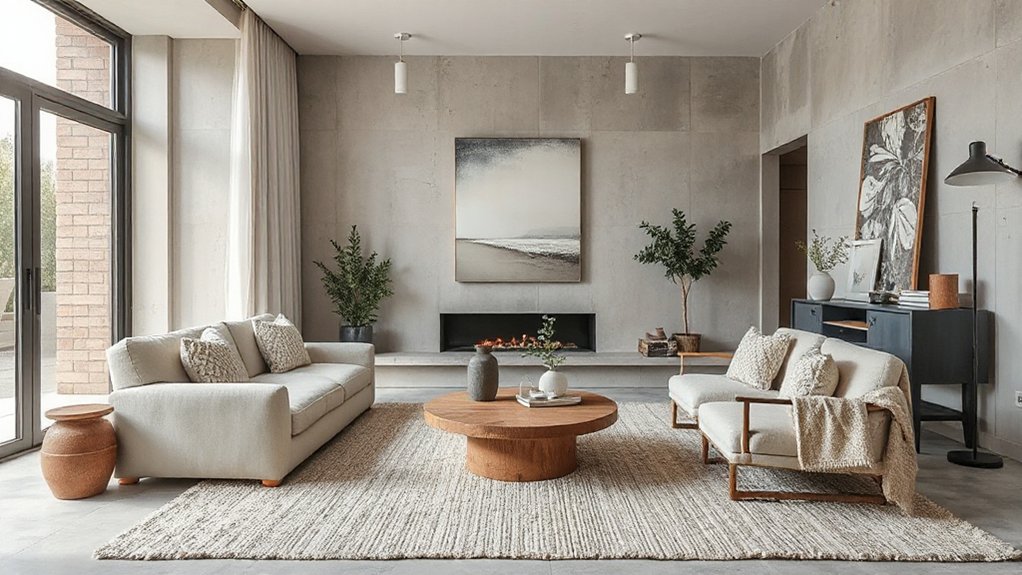
Mixing wood, metal, and stone creates a balanced interior by grounding warmth with industrial edge and natural restraint. You’ll layer these materials to define zones, not overwhelm them, letting each element speak without shouting. Start with a dominant wood presence for warmth, then introduce metal accents to sharpen lines, and finish with stone for texture and weight. Keep finishes cohesive: choose a shared undertone or patina to unify diverse materials. Proportion matters—aim for roughly equal visual weight, then let a single material dominate each focal point. Texture contrast matters too: matte wood, brushed metal, and honed stone read as distinct, yet compatible when restrained. Mixed materials foster design harmony, guiding the eye smoothly through spaces while preserving calm, cohesive neutrality.
Subtle Pattern Play That Feels Calm
Texture in neutral spaces comes alive with subtle patterns that don’t shout. You’ll notice how gentle hues and understated textures create calm rhythm across fabrics, wallpapers, and rugs. This pattern play guides the eye softly, keeping the room cohesive and serene while adding quiet depth.
Subtle Textures, Calm Spaces
Subtle textures quietly shape calm spaces, inviting you to notice the nuance without distraction. You’ll feel texture as a whisper, guiding mood without competing with color. Prioritize tactile variety that remains understated to preserve serenity. Textural contrast becomes your quiet separator, while sensory engagement deepens focus.
- Choose natural finishes with gentle contrast to highlight form without shouting.
- Layer textiles in adjacent tones to create depth and cohesion.
- Combine matte surfaces with subtle sheen for refined interest.
- Use soft, breathable materials to invite touch and comfort.
Focus on restraint: avoid busy patterns, noisy contrasts, or glossy extremes. Let light caress fabric and weave to reveal nuance. This approach keeps spaces calm, purposeful, and elegantly tactile.
Pattern Play, Gentle Hues
Pattern play introduces gentle structure to calm interiors, where soft motifs and restrained repetition create rhythm without noise. You’ll balance subtle patterns with solid tones, letting quiet repeats guide the eye rather than shout. Choose patterns that remain restrained—pinstripes, gentle geometric motifs, or tonal florals—so they read as texture, not distraction. Keep scale modest and spacing generous, so each element has room to breathe. Textured walls add tactile depth without overwhelming the room, while muted patterns on textiles reinforce calm cohesion. Pair them with tactile accessories—linen throws, woven baskets, and ceramic forms with soft finishes—to amplify texture without competing against the palette. Focus on harmony: unify pattern, color, and material to maintain serenity while inviting subtle interest.
Warm Finishes: Metallics, Weaves, and Naturals
Warm finishes bring depth to neutral interiors by pairing metallics, weaves, and natural textures with clean palettes. You’ll elevate calm spaces without overpowering them, using metallic accents, natural fibers, and tactile weaves to catch light and invite touch.
- Combine brushed brass or pewter with linen or cotton for a warm, everyday glow.
- Layer natural fiber rugs and jute baskets to introduce organic texture without visual noise.
- Mix subtly patterned weaves with solid surfaces to keep balance in your scheme.
- Prefer matte finishes over high gloss to maintain a serene, cohesive mood.
Keep the palette restrained; let textures speak. Subtle contrasts create sophistication, not noise. You’ll enjoy a refined warmth that remains versatile across rooms.
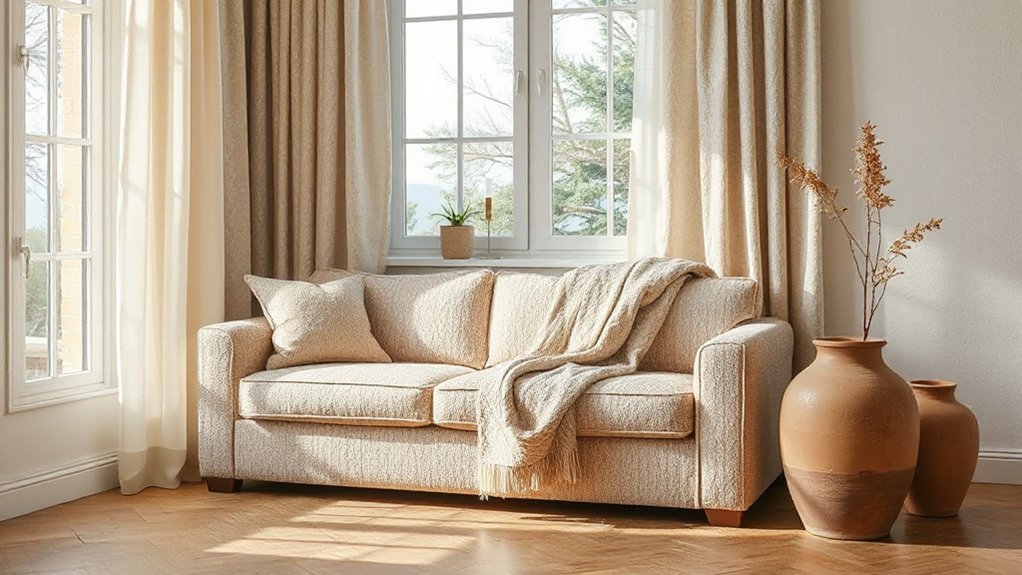
Accessorize With Purpose: Pillows, Rugs, and Throws
Pillows, rugs, and throws aren’t just finishing touches—they’re the practical tools that define texture, mood, and flow in a neutral space. You choose decorative accents that harmonize with your base tones, layering pattern, scale, and material for tactile interest. Start with a few statement pieces: a bold rug anchors the floor, as pillows frame seating with contrasting textures, and throws add warmth without overpowering the palette. Prioritize quality fabrics—linen, wool, cotton, or boucle—so you gain longevity and subtle luster. Vary weave and fiber across pieces to avoid monotony while preserving cohesion. Limit color pops to two or three accents, letting neutrals breathe. Resist clutter; each item should justify its place through function and mood, guiding movement and unity throughout the room.
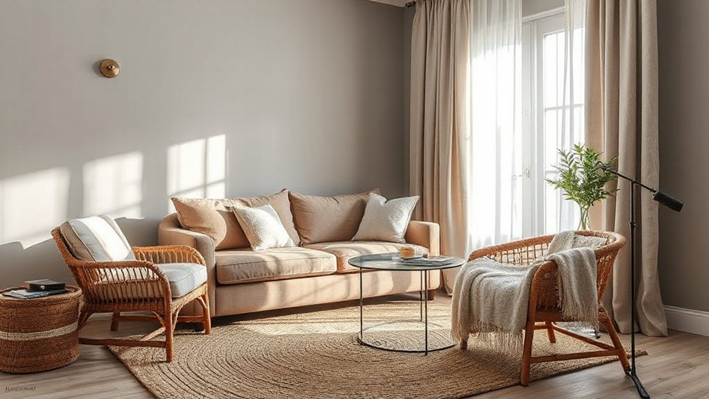
Practical Palette: Balancing Color, Light, and Scale
Balanced color temperature sets the mood, while layered light levels keep spaces usable from morning to night. You’ll balance warmth and coolness, adjust brightness, and prevent glare to reveal texture without overwhelming tone. Proportional scale elements guarantee furniture, art, and textiles feel cohesive, so the room reads intentional rather than crowded.
Balanced Color Temperature
To achieve a balanced color temperature, you need a deliberate mix of light sources that reads cohesive across spaces and tasks. Color harmony emerges when you pair warm and cool tones deliberately, not by chance. Use lighting techniques that align with function and mood, then refine with color materials that read consistently.
- Combine warm ambient light with cooler task light for contrast without glare.
- Layer sources at multiple heights to flatten shadows and unify tone.
- Calibrate your bulbs to a common Kelvin range within each area.
- Test at eye level across surfaces to ensure color consistency.
This approach keeps neutrals alive, avoids yellow cast, and supports clear, practical living.
Layered Light Levels
Layered light levels create depth and function by combining multiple sources at different heights and intensities. You blend ambient, task, and accent lighting to sculpt space, highlight texture, and guide movement. Use a dimmer for flexibility, so you shift mood as the day evolves. Avoid flat, single-source illumination that flattens texture; instead, layer lamps, sconces, and ceiling fixtures at varied heights to create contrast and visual rhythm. Introduce warm and cool tones purposefully to emphasize color and materiality, while keeping overall brightness balanced to prevent glare. Textural contrast emerges where light meets fabrics, wood grain, and stone, inviting touch and curiosity. This approach keeps interiors cohesive, functional, and inviting, without sacrificing restraint or harmony.
Proportional Scale Elements
When you align scale with color and light, rooms feel cohesive and intentional rather than cluttered or flat. Proportional scale elements guide how texture reads across surfaces, creating harmony without sameness. You balance large forms with smaller accents to avoid visual dominance or neglect. Textural contrast and surface variation emerge as you distribute weight, depth, and reflectivity with care.
- Assess major surfaces first, pairing substantial blocks with lighter textures to maintain rhythm.
- Vary texture levels across horizontal planes to keep the eye moving without overstimulation.
- Use color intensity to cue scale differences, ensuring darker tones anchor and lighter tones lift.
- Introduce subtle pattern shifts at different distances to reinforce depth and cohesion.
Frequently Asked Questions
How Do I Choose Texture for a Small Space?
You should mix patterns carefully and prioritize tactile layering. In a small space, choose one dominant pattern, add a subtle secondary, and then introduce textures like wool, linen, and rattan to create depth without crowding the room.
Can Texture Clash With Minimalist Design Principles?
Texture patterns can clash with minimalist design if you overdo them; you can avoid conflict by balancing with calm neutrals, like a concrete sofa, and a wool rug. Example: a glass-and-stone lamp achieves material contrast without chaos.
Which Textures Read as Luxurious on a Budget?
You’ll find affordable lux comes from textural contrast and fabric layering: opt for faux velvet cushions, linen blends, and boucle throws. You read as premium when you mix matte wools with satin accents and subtle sheers.
How Many Textures Are Too Many in One Room?
You should use a few textures, not many—aim for 3–5 in one room. Mix wall treatments with fabric layering to add depth, but keep balance, contrast, and cohesion so the space feels refined, not cluttered.
Do Texture and Color Affect Acoustics?
Yes, texture and color affect acoustics: you’ll improve sound absorption with porous fabrics and textured panels, while hard finishes reflect. Choose materials with sound absorption in mind and prioritize durability, ensuring long-lasting performance and resilient material durability.
Conclusion
Texture is the secret to calm, grounded interiors. You’ll layer fabrics, woods, metals, and stone to build tactile depth without shouting color. If you worry it’ll feel busy, lean into natural finishes and matte textures to keep the room cohesive. Start with soft linen, add a textured rug, then bring in subtle metals and wood. Finish with warm lighting and purposeful accessories. You’ll get a serene yet inviting space that stays true to neutral beauty.