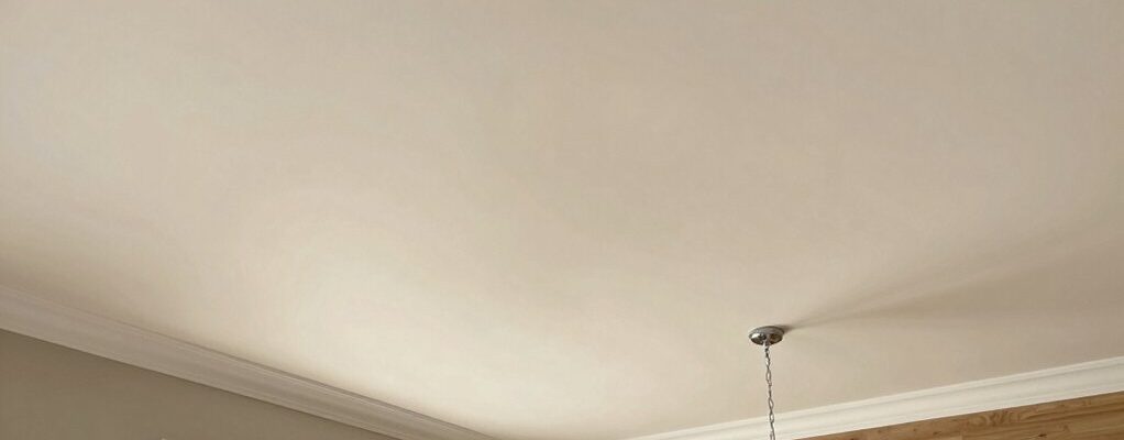
For the best ceiling color, start with brightness and mood. Whites brighten and lift ceilings; neutrals soften glare while keeping airiness; soft pastels add calm without overpowering. Consider ceiling texture and lighting—matte hides flaws, satin or eggshell reflects light with durability. Pair lightly lighter ceilings with darker walls for height, or mirror trims for cohesion. Preview samples on multiple walls at different times of day to avoid surprises. If you keep digging, you’ll uncover more expert tips.
Decide Your Ceiling Color: Criteria for Light, Mood, and Space

When choosing a ceiling color, start by considering how light, mood, and space interact in your room. You’ll balance brightness, atmosphere, and scale to set the overall feel.
Begin with ceiling texture; subtle textures can soften glare and add depth, while flat surfaces keep a clean, modern look.
Next, choose a paint finish that suits your lighting and maintenance needs. Matte finishes hide flaws but show fingerprints more readily in busy areas, while satin or eggshell offer durability with a gentle sheen that helps reflect light without being harsh.
Consider how your chosen color interacts with wall tones and trim, ensuring contrast or harmony as desired.
Finalize your decision by previewing color samples on multiple walls at different times of day.
Whites vs. Neutrals: How Each Tone Affects Brightness
Whites reflect more light and can brighten a room, making ceilings feel higher and spaces feel more open.
Neutral tones lean into luminosity with subtler brightness shifts, so a small change in shade can noticeably alter how the room reads.
Your choice should consider how the shade interacts with wall color, natural light, and the perceived space.
Brightness With Whites
Choosing the right white or neutral can dramatically alter a room’s brightness. When you pick whites or neutrals, you control how light bounces off the ceiling. A pure white reflects more light, making a low-ceiling feel larger and a bright room feel airy.
Slightly warm whites soften glare and create coziness, while cool whites pull in daylight for a crisper, modern vibe. Your ceiling texture can amplify these effects: smooth ceilings enhance brightness, while subtle textures scatter light for gentle diffusion.
Consider ceiling moldings as focal points you can paint in a brighter shade to draw the eye upward without overpowering the space. Balance contrast with adjacent walls to prevent a washed-out look, ensuring a balanced, luminous ceiling that supports the room’s mood.
Neutral Tones Luminosity
Neutral tones affect brightness differently than pure whites: neutrals like off-whites, beiges, and greiges tend to soften reflections while still keeping a room airy. You’ll notice that these hues distribute light more evenly, reducing harsh glare from direct illumination.
With neutrals, texture pattern details emerge subtly; you perceive depth without overpowering the space, making ceilings feel higher and rooms more balanced. Choose warm neutrals to enhance coziness, or cool neutrals to amplify modern clarity.
The luminosity shifts as you introduce texture patterns or gloss differences in the paint finish, influencing perceived brightness. When pairing with ceiling moldings, neutrals help moldings read crisp rather than punchy, preserving architectural interest.
In short, neutrals offer controlled brightness, allowing you to fine-tune atmosphere without sacrificing openness.
Shade Impact On Space
Shades dramatically shape how a ceiling reads, and whites and neutrals each narrate brightness in a distinct way. In this space, you’ll notice whites bounce more light, creating an expansive feel, while neutrals ground the room with subtler reflectivity.
If your goal is height, opt for a brighter white with a slight cool undertone to maximize perceived ceiling height. When you choose neutrals, select warmer or cooler tints to tune mood without sacrificing light.
Consider ceiling paint gloss judiciously: higher gloss adds crispness and helps reflectors work harder, yet can highlight imperfections. Eco friendly paints offer low odor and fewer volatile compounds, supporting a healthier environment during application and wear.
Balance gloss and tone to achieve a balanced, airy, and polished finish.
Pastel Ceilings: Subtle Blues and Soft Hues That Elevate Rooms
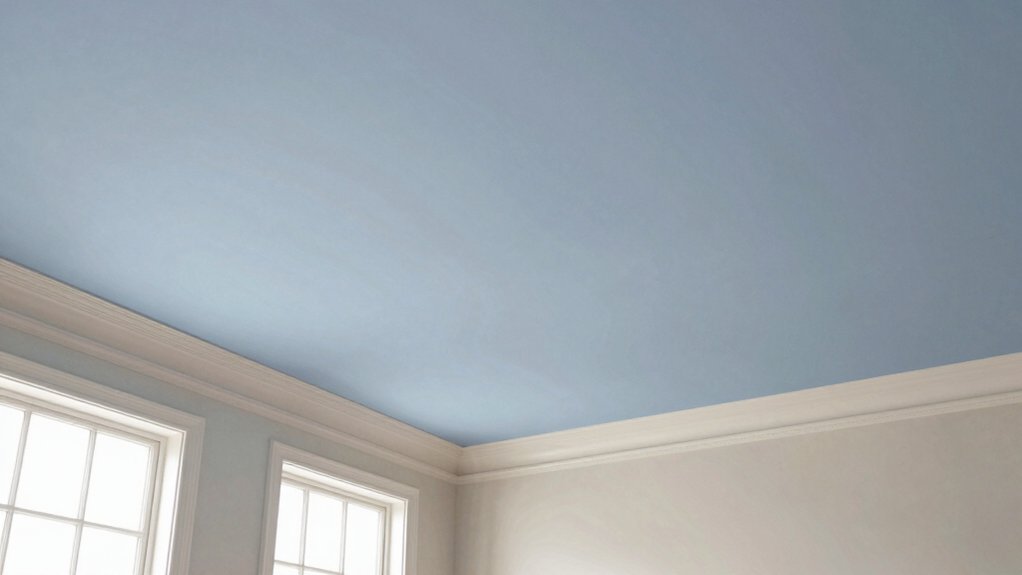
Pastel ceilings can instantly lift a space without overpowering it, using soft blues and gentle hues to create an airy, calming backdrop. You’ll notice how subtle tones brighten rooms without shouting for attention.
Choose pale blues, misty greens, or lavender-washed whites to maintain openness while adding personality. In rooms with ample light, these shades reflect daylight for a fresh, expansive feel; in low-light spaces, they prevent dinginess and add warmth.
Pay attention to ceiling textures; a matte or eggshell finish keeps the look refined, while very light gloss can add a touch of modern polish. Decorative finishes, like a whisper-soft plaster or subtle faux texture, can elevate the ceiling without overwhelming the palette.
Keep the focus on balance and clarity.
Pairing Ceiling Color With Walls and Lighting: Practical Rules
Pairing ceiling color with walls and lighting isn’t about chasing trends; it’s about creating balance that guides the eye and mood. When you pair thoughtfully, you avoid competing tones and instead build a cohesive scene.
Consider how ceiling texture options interact with wall color to shape perceived height, depth, and lighting warmth. Use decorative ceiling patterns sparingly to add interest without overwhelming the room.
- Start with a neutral ceiling base, then introduce wall color to reflect lighting quality.
- Align ceiling texture options with the room’s function—soft textures for living areas, smoother finishes for kitchens or offices.
- Use a subtle decorative ceiling pattern as an accent, not a focal point, to keep harmony.
This approach keeps the space calm, inviting, and visually balanced.
Room-by-Room Ceiling Color Ideas: Quick Paths to Inspiration
Room-by-room ceiling color ideas start with understanding how ceiling tones create room mood, lighting effects, and perceived height. Consider how ceiling color changes room lighting and elevate or shrink spaces. Then match your color choices to each room’s function.
We’ll map simple ceiling-color pairs to height perception tips and practical fixes for lighting.
Ceiling Color Combinations
Choosing the right ceiling color can transform a space, and the best combinations depend on your room’s function, light, and existing palette. You’ll find quick paths by pairing tones with purpose, not popularity.
- Balance bold with soft: use a muted ceiling color to let architectural details and ceiling texture stand out, while decorative ceiling designs become focal points.
- Contrast strategically: a lighter ceiling against darker walls adds height and drama without overwhelming the room.
- Harmonize by temperature: cool palettes feel airy; warm tones feel cozy. Align ceiling color with wood, textiles, and artwork for cohesion.
These combinations work across rooms, emphasizing how color, texture, and design elements interplay.
Room Lighting Effects
Lighting dramatically shapes ceiling color perception, so consider how each room’s light source—natural daylight, warm bulbs, or cool LEDs—will alter tone and brightness.
In this room-by-room guide, you’ll match ceiling color to your lighting strategy rather than chasing trends. Evaluate how daylight shifts from morning to evening, then test with typical bulbs to see if the chosen paint finish—matte, eggshell, or satin—retains or softens contrast.
Ceiling texture plays a pivotal role: subtle texture can diffuse harsh light and hide imperfections, while smooth surfaces reveal color shifts more readily.
For bright, high-contrast rooms, choose a slightly cooler or lighter shade to avoid glare; for cozy spaces, a warmer, muted hue maintains ambiance.
Keep your planning concise, deliberate, and aligned with overall color goals.
Height Perception Tips
To heighten or shrink perceived ceiling height, start with color tone: lighter, cooler shades push the ceiling visually upward, while deeper, warmer hues bring it closer. You’ll use this principle room by room to tailor perception, pairing hues with ceiling texture and architectural details for impact.
- Choose pale, cool neutrals for small or low rooms to create openness and airiness without glare.
- In living areas with dramatic architectural details, contrast a lighter ceiling with darker walls to emphasize height and depth.
- For rooms with ornate molding or beams, mirror the ceiling color in trims to unify proportions and visually extend the space.
These strategies balance light, texture, and structure, shaping perceived height precisely.
Painting Ceilings Like a Pro: Tools, Prep, and Techniques
Painting ceilings well isn’t just about picking a color; it’s about the right tools, solid prep, and steady technique. You’ll start with quality brushes, rollers designed for ceilings, and a roller tray with a good nap for your texture. Use a lightweight, cut-in brush for edges, then smooth with a long‑roller run. Protect floors and walls, and seal off adjacent areas to prevent splatter.
Prep matters: repair cracks, sand rough patches, and dust surfaces before you prime. Choose a compatible primer and let it dry fully. Apply two coats of your chosen paint finish, maintaining a steady hand and a wet edge to avoid lap marks.
Consider ceiling texture and lighting, and don’t rush the final pass for a flawless, even look.
Frequently Asked Questions
How Long Does Ceiling Paint Color Typically Last Before Fading?
Ceiling paint typically lasts about 5 to 10 years before noticeable fading. You’ll influence paint longevity with proper prep, quality materials, and ventilation; fading factors include sunlight exposure, pigment quality, and cleaning frequency. Inspect periodically to maintain a fresh look.
Can Ceiling Colors Affect Room Acoustics or Sound Reflection?
Sound reflection can shift with ceiling color, but you won’t notice dramatic changes; lighter tones brighten, while darker shades subtly alter diffusion. You’ll get acoustic enhancement by using matte finishes and appropriate lighting, reducing glare and improving clarity.
Are There Health Considerations With Ceiling Paints and Primers?
Yes, there are health considerations with ceiling paints and primers. You should check VOC emissions and paint allergy risks, choosing low-VOC products and protective gear to minimize exposure during application and curing.
Which Finishes Are Best for Low-Humidty Bathrooms and Kitchens?
For low-humidity bathrooms and kitchens, choose moisture resistant finishes and mold resistant coatings. You’ll protect ceilings against moisture, reduce mold risk, and simplify cleaning while maintaining a crisp, durable, and professional-looking surface.
Do Ceiling Colors Impact Resale Value or Perceived Room Height?
Ceiling colors subtly steer perception, but don’t drastically alter resale; they influence perceived height and mood. You’ll notice trends and durability mater in finishes—ceiling color trends guide choices, paint durability keeps spaces vibrant and resale-ready.
Conclusion
Light ceilings can lift a space, while darker tones add coziness. Use neutral or pastel shades to keep rooms bright without glare, and consider how lighting and wall color flip to bring balance. Pairing matters: align ceiling with purpose, not just trend. Stay practical with prep and tools, but don’t fear a bold accent in the right room. Think of ceilings as the stage lights—brighten the scene, soften the mood, and let the whole room shine.