North-facing rooms can feel cooler and flatter because they miss direct sun, so you’ll want warm neutrals with subtle pink, green, or taupe undertones and low chroma to brighten without leaning yellow. Test samples at morning, noon, and night under both natural and artificial light, then balance cool and warm undertones to complement furnishings and skin tones. Settle on mid-tones with satin or eggshell finishes to reflect light and add depth, but watch for shifts that keep the space vibrant yet sophisticated throughout the year.
Why North Light Challenges Paint Choices
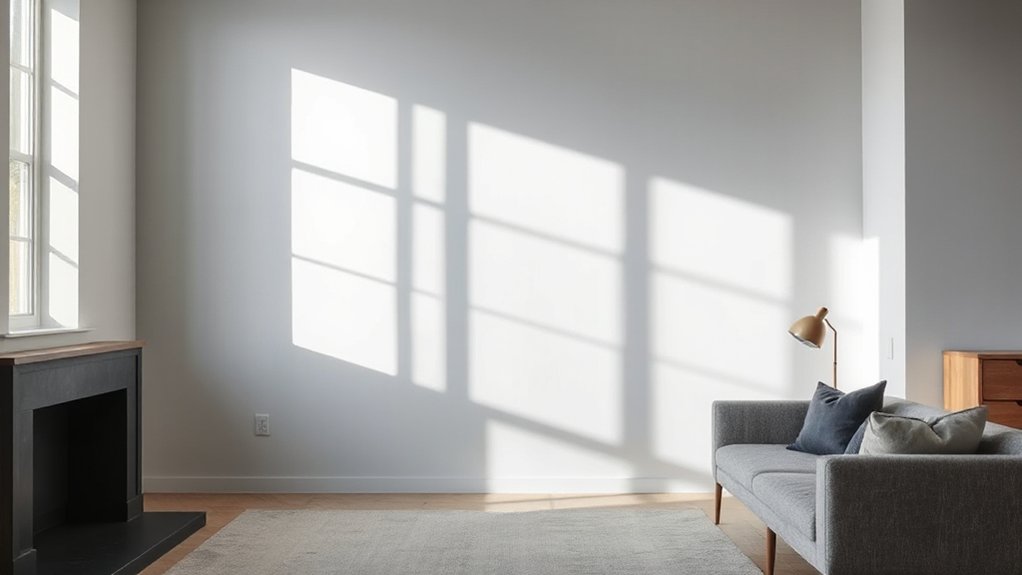
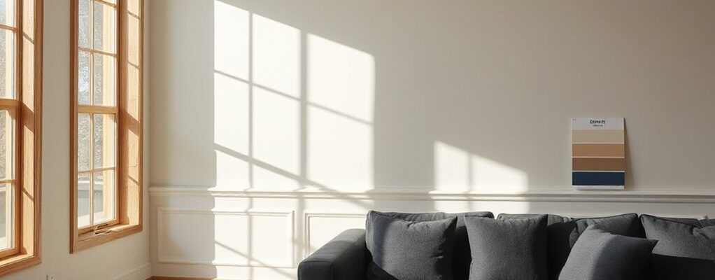
North-facing light tends to skew cool and dull, making paint colors read differently than they do in sunlit rooms. You’ll notice cooler grays and blues appear dominant, while warm undertones retreat. This shift feeds north light misconceptions, leading you to overcorrect with saturated hues that look flat or muddy in practice. Instead, test under real conditions and compare against neutral benchmarks at multiple times of day. Consider pigment saturation, not just hue, because light alters perceived depth and clarity. Paint durability matters in evolving conditions: cooler environments can reveal premature wear or color drift from fading or staining if you choose low-quality formulations. Select paints with stable titanium dioxide loads and robust gloss options to preserve color integrity, while you reserve bolder statements for accent walls rather than entire rooms.
Test Color Samples at Morning, Noon, and Night
To verify color behavior across the day, test paint samples at morning, noon, and night in the actual room. You’ll see how Lighting effects shift with sun position and artificial light, revealing subtleties that swatches miss. Use color testing techniques that track daylight changes and ceiling reflections, not just wall appearance. Document each sample under consistent lighting to compare hue, value, and saturation shifts. This disciplined approach prevents misreading a color’s true character.
- Observe pigment shifts as daylight evolves
- Compare artificial light interactions with daylight tones
- Note contrast against trims and furniture
- Record temperatures of change to guide final selection
Warm Neutrals That Brighten Without Yellow
Warm neutrals can brighten north-facing rooms without leaning yellow, by emphasizing cooler undertones and balanced white bases. Consider warm tone alternatives that retain depth while avoiding muddying greens or pinks, so the space reads clean in low light. Pair these with brightening neutral palettes that reflect more light and preserve true color under morning, noon, and night.
Warm Tone Alternatives
If you want warmth without yellow bias, consider warm neutrals that lean toward pink, green, or taupe undertones. These tones maintain brightness in north-facing rooms while avoiding yellow cast. Use them as anchors for a cohesive palette, then layer depth with materials and finishes that read as warm rather than flat. Apply strategic contrasts to keep spaces lively, not dull.
- Pink-leaning neutrals provide soft luminance that pairs with cool daylight for balanced warmth.
- Green-tinged hues introduce subtle contrast, enhancing depth without overpowering or skirting toward greenish cast.
- Taupe-based neutrals anchor furniture and textiles, grounding brighter accents.
- Finishes and lighting bias toward neutral warmth to sustain a consistent, warm accent overall.
Warm accent and cozy textiles seal the effect, elevating texture without shifting color.
Brightening Neutral Palettes
Brightening neutral palettes expand warmth without yellow bias by leaning into pink, green, and taupe undertones that reflect more light. You’ll want neutrals with soft pinks or mauve hints to counterbalance north-facing lighting, plus green undertones that read as cool warmth rather than flat gray. This approach minimizes yellow cast while preserving cozy ambience. In practice, choose mid-tone hues with low-chroma saturation to avoid muddy results under cool daylight. Color psychology suggests these tones enhance perceived brightness and approachability without overwhelming the space. For finish options, satin or eggshell provide subtle sheen that amplifies reflected light without glare, whereas matte reduces glare but can look flat if too dark. Apply strategic swatches and test under different times of day to verify color stability. Avoid extremes; aim for balanced, luminous neutrals.
Undertones That Flatter Furnishings and Skin Tones
You’ll start by prioritizing subtle undertone harmony to keep furnishings and skin tones reading cohesive. Choose skin-tone friendly hues that align with the room’s lighting, then test swatches for true undercurrent before committing. This sets the stage for precise furnishings color coordination and keeps north-facing spaces visually balanced.
Subtle Undertone Harmony
Subtle undertone harmony means choosing undertones that complement both furnishings and skin tones without shouting. You’ll align undertones with room elements to prevent clash and create cohesive depth, using precise swatches and side-by-side comparisons. Focus on how undertones influence perceived warmth, brightness, and harmony in north-facing light.
- Complementary color schemes: pair cool and warm undertones to balance gray daylight, avoiding chromatic competition that dulls textures.
- Texture and pattern considerations: select fabrics and surfaces with undertones that repeat subtly, enriching depth without loud contrast.
- Lighting-retrofit awareness: test samples under LED and daylight bulbs to confirm undertone steadiness across conditions.
- Furniture coordination: ensure finishes echo undertones across wood, metal, and upholstery for a unified look.
Skin-Tone Friendly Hues
Skin-tone friendly hues pick up where subtle undertone harmony leaves off, focusing on undertones that flatter diverse complexions while still supporting furnishings. You’ll prioritize skin undertones when pairing wall colors with fabrics and accessories, ensuring contrast that reads natural rather than clinical. In practice, lean into balanced chroma and neutral bases that harmonize with warm and cool undertones without washing you out. Color psychology guides you to choose tones that evoke calm, warmth, or clarity, depending on room use and lighting. For north-facing spaces, test mid-range values with subtle warmth under daylight and incandescent it’s essential to verify how undertones shift after dusk. This approach minimizes fatigue, enhances cohesion, and preserves visual depth across textures and surfaces.
Furnishings Color Coordination
Furnishings color coordination hinges on selecting upholstery and accessory hues that harmonize with skin undertones while maintaining visual cohesion with wall colors and architectural light. You’ll use undertone-aware color matching strategies to unify textiles, rug palettes, and decor metals, ensuring depth without overpowering the north-facing glow. Prioritize midtones and soft contrast to preserve clarity across tones, avoiding washed-out appearances.
- Align upholstery undertones with the wall’s cool or warm bias to sustain furnishings harmony.
- Pair metallic accents and wood finishes to reinforce a consistent color depth.
- Employ a restrained secondary palette for pillows and throws to avoid visual noise.
- Test fabrics in natural and artificial light to validate enduring color matching strategies.
Accent Colors to Add Depth in Dim Light
Accent colors in dim light can dramatically alter how depth is perceived in a north-facing room. In dim conditions, you’ll exploit contrast and subtle shifts to reveal structure without overpowering it. Choose accent hues that sit near the wall color on the color wheel to create controlled depth through Complementary color schemes, then push the effect with deliberate textures. Use small, focused instances—trim, a single feature wall, or textiles—to avoid flattening the space. Texture enhancements—matte walls with satin accents, or a tactile woven shade—add perceived warmth and dimension without bright reflections. Pair accents with neutral bases to prevent muddy undertones, and test under the room’s lighting at different times. Record small adjustments to refine the balance before finalizing the palette.
Room-by-Room North-Light Palettes
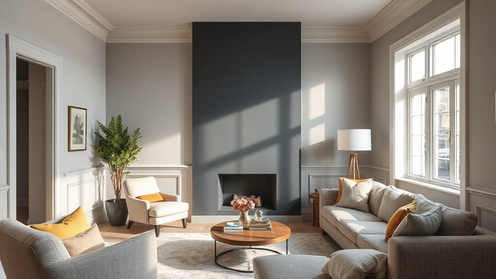
North-facing rooms rely on carefully curated palettes that maximize available light without washing out color. In room-by-room north-light palettes, you tailor temperature and contrast to the function of each space, not just overall mood. You’ll balance cool and warm neutrals to counter North light myths that flatten depth, and you’ll pick pigments with proven paint durability for long-term color stability. This approach keeps rooms feeling bright yet sophisticated, even in deep winter.
- Living areas: light, low-saturation neutrals with subtle depth
- Kitchens: durable, medium-contrast yellows and creams for clarity
- Bedrooms: calming, cool-toned hues that reflect soft daylight
- Home offices: sharper whites with a touch of warmth to prevent glare
Finishing Touches to Keep North-Lit Rooms Inviting
To keep north-lit rooms inviting, you’ll layer finishing touches that enhance light without emphasizing it, prioritizing texture, contrast, and subtle color echoes. You’ll lean on decorative accessories to add narrative without saturating the space, choosing pieces with a sheen that catches daylight and soft shadows. Integrate wall textures strategically: a low-relief plaster, linen-weave wallpaper, or subtle brick can create depth that reads as warmth rather than brightness. Keep patterns restrained to avoid competing with cool north light; repeat a single motif across cushions, throws, and rugs for cohesion. Control contrast with warm neutrals against cool walls, ensuring edges remain crisp yet soothing. Finally, swap seasonal accents to preserve balance, maintaining a calm, cohesive palette that stays inviting year-round.
Frequently Asked Questions
How Do I Choose Paint Finishes for North-Facing Rooms?
Yes, you should pick a higher-sheen finish for north-facing rooms to reflect more light; start with Paint sheen options like satin or eggshell, and balance color temperature choices so cool or neutral tones stay bright under diffuse daylight.
Can Lighting Fixtures Affect My Color Perception Indoors?
Yes, lighting fixtures affect color perception indoors. For example, you switch to warm LEDs and the accent walls appear cozier; consider paint durability for long-term color stability, ensuring your fixtures don’t wash out or alter hue.
Which Wall Colors Reflect Natural North Light Best?
You should choose light, cool whites or pale grays with low color temperature, plus subtle wall textures to reflect north light evenly. These colors minimize warmth shifts while maximizing brightness and depth in your space.
Do Paints With Blue Undertones Work in North Light?
Indeed, blue undertones work in north light, you’ll just misread the Color temperature. Embrace cooler hues with suitable Paint sheen, because balance reveals depth, not distraction, and your space benefits from precise, technical, eyes-open choices.
How Can I Prevent Color Creep in Dim Rooms?
To prevent color creep in dim rooms, you should adjust color temperature with balanced whites and avoid overly warm tones; choose paints with high durability, and guarantee proper primer, lighting, and finish for consistent, lasting appearance and color stability.
Conclusion
You’ll notice the pattern when it clicks—north light rewards deliberate choice. Pick warm neutrals with pink, green, or taupe undertones, test at dawn, noon, and dusk, and stay near mid-tones with satin finishes to dodge harshness. Coincidence helps: the same hues that flatter your furnishings often flatter your skin, too. When color feels balanced across undertones, the room stays inviting all year, and a subtle accent can reveal depth you didn’t expect.