You steer a bright, open-plan kitchen and living space with a palette that shifts as the day does. Start with a neutral base that stays calm through changing light, then layer warm accents to carve zones without breaking flow. Add sparse blues and greens for calm, urban-air moments, and finish with textures and thoughtful details that knit everything together. The result feels expansive yet intimate—and you’ll want to see how far you can push it.
How UK Light Shapes Open-Plan Color Choices
Natural light is your strongest design ally in UK open-plan spaces. You feel its influence from dawn to dusk, guiding how you select color and balance. Natural sunlight floods rooms with a soft, evolving palette, shifting the mood as the day progresses. You match furniture and cabinetry to color temperature signals—cool mornings; warmer evenings become your cue for inviting textiles and accents. You’ll choose whites and neutral tones that reflect light without washing out character, then introduce accent hues that respond to outdoor weather and window orientation. Remember, light quality changes with seasons and clouds, so plan flexible schemes that stay legible under varying tones. Your aim: clarity, harmony, and a space that feels bright, calm, and purposefully designed.
Quick Start: Pick a Neutral Base for Your Kitchen-Living
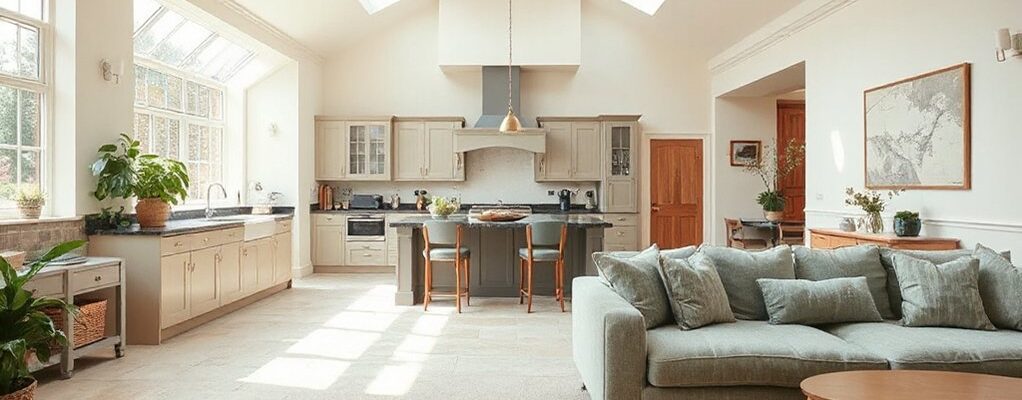
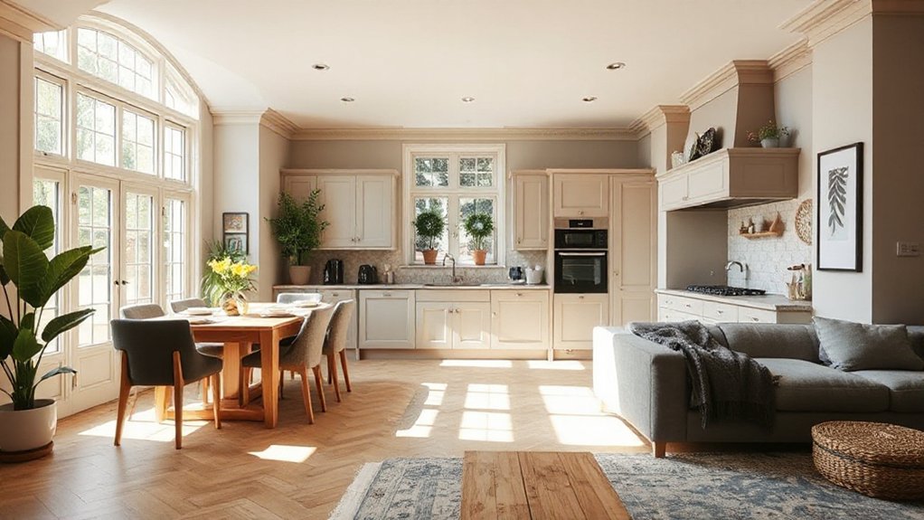
A solid neutral base is your backbone: it anchors the room, widens sightlines, and makes every color you add feel intentional rather than competing. You’ll choose a calm foundation—think warm eggshell, cool greige, or a soft taupe—that harmonizes cabinets, walls, and flooring without overpowering architectural features. Your goal is balance, not bland sameness. Consider how natural light shifts across surfaces and pick a base that stays steady from morning to evening. When planning furniture placement, let the base guide flow: keep sightlines open, scale pieces to space, and group seating to foster conversation. For storage solutions, opt integrated, unobtrusive designs that preserve the calm. A restrained base makes accent colors pop and rooms feel timeless.
Warm Tones for Cozy Zoning and Flow
Warm tones warm more than walls—they shape flow. In an open-plan UK home, you’ll use warm hues to cue zones without heavy dividers. Think soft taupes, amber beiges, and clay reds that anchor dining areas, living nooks, and prep zones with gentle passages. Color psychology suggests these tones invite comfort, conversation, and appetite, guiding movement from kitchen tasks to lounging moments. You’ll optimize furniture placement to reinforce purpose: place a compact sofa array or a slim console to define the living edge, then let a warm rug bridge the gap toward dining. Avoid sharp contrasts; let architectural light reveal the depth of your palette. Subtle shifts—larders of warmth near counters, cooler edges by windows—keep the flow airy and cohesive.
Calm Blues and Greens for Urban Open Spaces
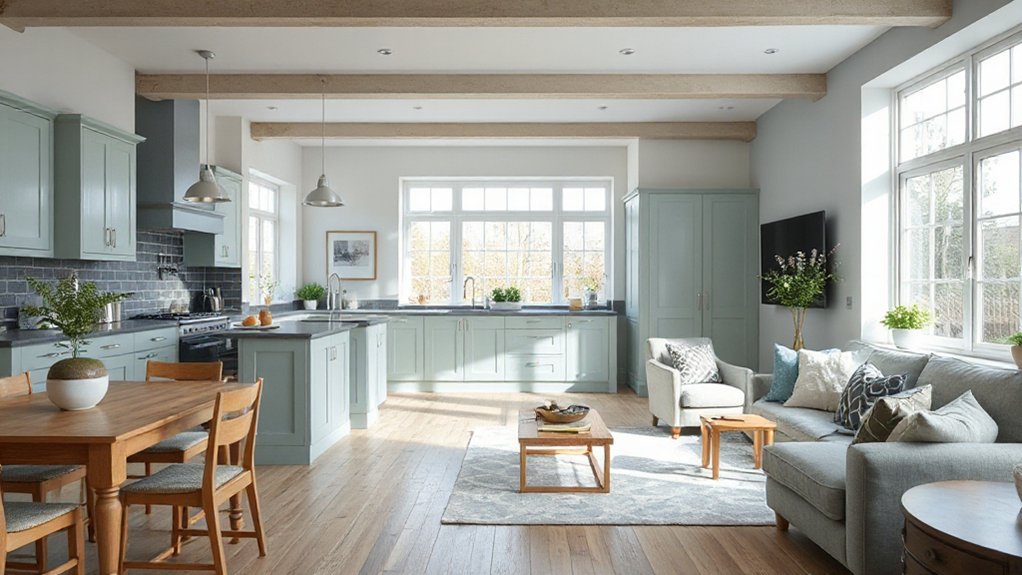
Calm blues and greens soften urban open spaces, weaving serenity into high-rise kitchens, living zones, and dining corners alike. You’ll feel calmer when you pair airier blues with mossy greens, a duo that lowers visual noise while preserving depth. Color psychology guides your choices: cooler tones reduce perceived density, making compact areas feel more expansive, while subtle warmth in accents prevents sterility. In urban aesthetics, texture matters as much as hue—matte walls, linen fabrics, and timber details add tactility without shouting. Let light play a supporting role; soft whites and pale neutrals bounce daylight into corners, enhancing the palette. Aim for balance: quiet, confident color blocks that invite linger, conversation, and ritual without overwhelming the space.
Finishes, Accessories, and Practical Zoning Tips for Open Plans
In open-plan spaces, finishes, accessories, and smart zoning work together to keep the flow intact while defining purpose. You’ll balance color contrast with tactile surfaces, ensuring the kitchen, living, and dining zones feel cohesive yet distinct. Choose decorative accents that echo your palette across lamps, textiles, andthrows, tying areas without crowding sightlines. Use purposeful zoning lines—rug edges, ceiling cues, and furniture placement—to guide movement and sound, not barriers. For practicality, integrate hidden storage and durable surfaces that shrug off daily use while maintaining polish.
- Layer finishes to create subtle differentiation without shouting.
- Align decorative accents across zones for a unified narrative.
- Employ contrasting materials to emphasize function and flow.
Frequently Asked Questions
How Can I Test Color Palettes With Real Lighting Before Painting?
Yes—use lighting simulation apps and digital color testing tools to preview palettes under real daylight and artificial light. You’ll compare tones, adjust brightness, and choose confidently before painting, aligning mood with your space and timings.
Which Colors Hide Kitchen Stains Best in Open Layouts?
Like a magnet, your eye hides stains best with warm neutrals and matte finishes. You’ll choose wall decoration and align furniture coordination to minimize glare, creating cohesive spaces that mask marks while preserving light, depth, and aspirational, practical style.
What Impact Does Ceiling Height Have on Color Perception?
Ceiling height influences perception: higher ceilings create airiness, while lower ones feel cozier. You’ll notice ceilings can visually expand rooms through ceiling illusions, and color choices heighten length and proportion, enabling height enhancement and measured, aspirational balance.
How Do I Balance Color With Acoustics in Open Spaces?
Imagine a hush you barely notice after a soft exhale: you balance color with acoustics by acoustic panel integration, pairing warm hues with sound absorption techniques, shaping atmosphere while preserving clarity and comfort in your open-plan space.
Are There Color Tricks to Visually Widen Small Rooms?
Yes—use light neutrals and cool accents to visually widen spaces. Color psychology guides you to airy vibes, while color coordination ties furniture and walls together, making the room feel expansive and cohesive.
Conclusion
In open-plan UK homes, light does all the heavy lifting—so you don’t have to. Pick a friendly neutral, sprinkle warm accents, and let blues or greens whisper calm into hallways. Layer textures, mix finishes, and watch “zones” become your best supporting actors. If it all feels a touch too harmonious, pat yourself on the back for finally achieving the perfect, photo-ready chaos you’ll pretend to crave. Because serenity in a shared space is, apparently, wildly aspirational. Irony duly noted.