You may not know that many 70s and 80s British interiors relied on modular, chrome-accented furniture to create flexible spaces rather than true open plans. You’ll define goals and budget first, then pair period-accurate colors with modern comfort to keep the look cohesive. You’ll plan lighting as a layered system and choose reversible updates that preserve character. There’s more to balance—so you’ll want to see how layout, storage, and subtle tech can work together without compromising the era’s charm.
Identify Your Space: Key 70s/80s British Traits to Note
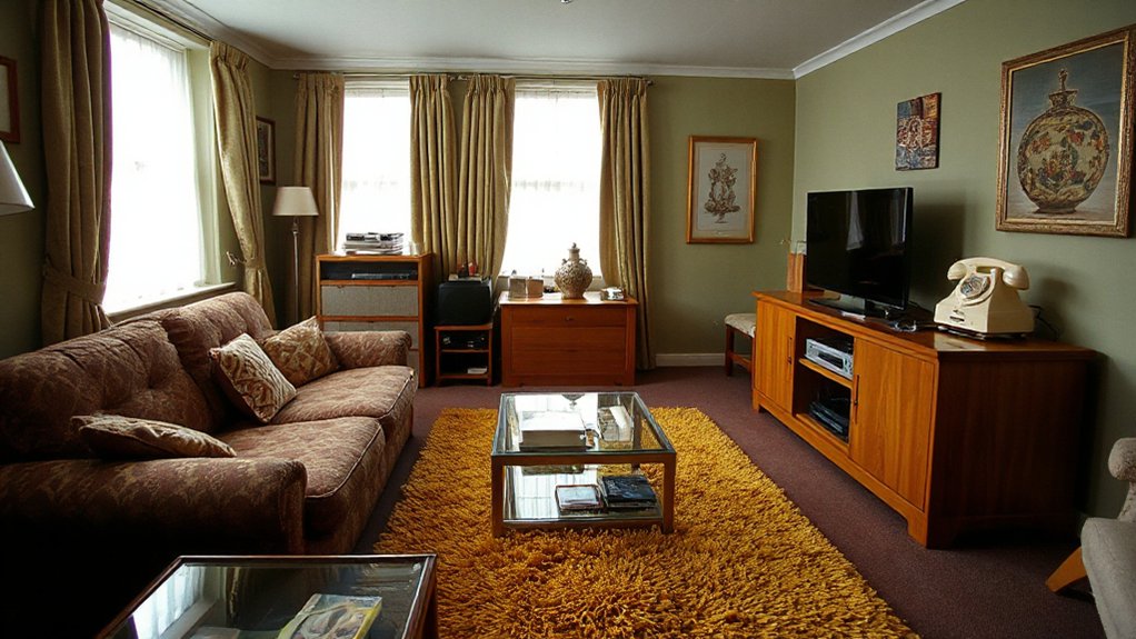
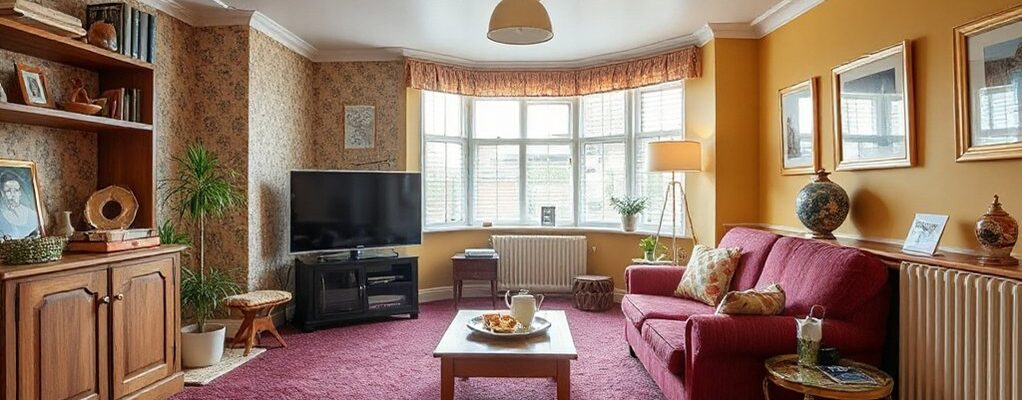
Identifying a space from 70s and 80s Britain means spotting a mix of bold color, modular furniture, and practical materials that reflect both affordability and experimentation. You observe how space planning favors multiuse layouts, with room dividers, low shelving, and seating that doubles as storage.
Pattern and texture cues carry archival weight: wallpaper patterns echo graphic print runs and corporate color palettes, while fabric textures reveal economy-meets-yield—vinyl, boucle, and cotton blends surface in upholstery. You note ceiling heights, parquet or laminate floors, and the persistent presence of warm woods juxtaposed with chrome hardware.
The era’s lighting often centers on pendant clusters or floor lamps that sculpt space. Through these markers, you map provenance, scale, and potential for authentic restoration.
Define Goals and Set Your Budget
Start by translating your archival observations into concrete targets: which rooms demand the most transformation, what era-appropriate details you aim to preserve, and how much flexible space you can allocate for new storage or seating.
You then define measurable goals: functional zones, improved flow, and authentic micro-details that support the period voice.
Translate these into a budget framework with line items for essential updates first, then enhancements.
Prioritize durable, period-appropriate textiles for seating, window treatments, and soft finishes, while reserving funds for a few authentic decorative accents that anchor the look.
Set a ceiling and a contingency allowance to manage unexpected needs.
Track progress against milestones, adjusting targets as discoveries emerge, keeping decisions aligned with archival evidence and practical constraints.
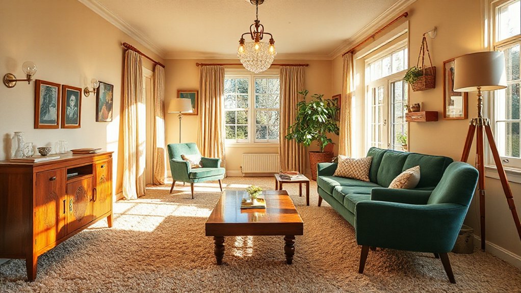
Pick a Palette: Period-Accurate Colors With Modern Comfort
Because period accuracy hinges on how color informs space, begin by cataloging the hues that defined your intended era and testing them in small, controlled swatches before full-room application.
You’ll map the palette to room function, era-attribution, and material finishes, ensuring cohesion without homogeneity.
Analyze color relationships—complementary, analogous, and triadic schemes—to support architectural features and built-ins.
Color coordination becomes a disciplined practice: assign dominant tones to walls, secondary hues to upholstery, and accent colors to accessories, preserving period character while easing daily living demands.
Use archival references to justify your choices, then translate them into practical paint selections.
Embrace paint techniques that convey era texture—flat, eggshell, or satin finishes—without compromising modern durability, washability, and subtle sheen expectations.
Light It Right: Practical Modern Lighting for Vintage Rooms
You’ll balance brightness with layered light to reveal the room’s vintage character while meeting modern needs. Consider warm-neutral ambience and essential controls that keep the space comfortable without clutter.
Vintage fixtures anchor the look, but you’ll pair them with contemporary controls for practical, precise illumination.
Brighten With Layered Light
Layered lighting preserves the vintage room’s atmosphere while boosting usability, combining ambient, task, and accent sources to create a flexible, daylight-friendly effect. You map each layer to purpose, not just mood, ensuring the space remains legible and inviting.
Ambient light provides consistent coverage, while task lighting targets reading corners, desks, and work surfaces without glare. Accent light highlights architectural details, colorwork, and fabric textures, reinforcing the period’s character.
Plan with color coordination in mind: warm whites for brass fixtures can harmonize with amber glass, while cooler LEDs emphasize mid-century chrome.
Consider furniture placement to avoid shadowy zones; lamps should weave through seating groups rather than sit statically at ends. Use dimmers to modulate intensity and preserve depth, preventing flat illumination that dulls vintage contrasts.
Warm Neutral Ambience Essentials
Warm neutral lighting defines a vintage-feel room without overpowering its character. You’ll balance ambience by selecting lamps that emit soft, even diffusion rather than harsh glare, preserving timber tones and plaster textures.
Analytically, this means favoring warm white LEDs or filtered tungsten equivalents with CRI high enough to render antique textiles and retro accessories accurately.
Position layers to avoid flatness: a dominant ceiling wash, supplemented by table and floor lamps that sculpt shadows and highlight architectural details. Keep color temperatures consistent across sources to maintain cohesion.
Practical notes include dimming capabilities for scene-setting and calibrations that prevent yellowing reflective surfaces.
In archival terms, this approach documents provenance through light, enhancing the room’s period details without signaling a harsh modern overlay.
Vintage Fixtures, Modern Controls
Vintage fixtures anchor the room’s period character, while modern controls keep them practical and reliable. You assess how antique hardware on luminaires preserves provenance, then weigh it against ease of use, cost, and energy efficiency.
In archival fashion, you map fixtures to focal points—wall sconces beside seating, central pendants over tables—ensuring scale and light quality align with room proportions. You describe contrasts between brass or steel finishes and the softer textures of retro textiles, noting how reflections alter mood across hours.
Modern controls translate restraint into habitability: dimmers, programmable timers, and remote access help maintain ambience without sacrificing authenticity. This approach preserves narrative integrity while delivering dependable performance.
The result is coherent lighting that respects history without sacrificing daily practicality.
Rework Layout: Smart Storage and Multi-Function Furniture
Reworking the layout starts with smart storage and multi-function furniture that maximize space without sacrificing legibility or charm. You analyze how current rooms fail to read as cohesive spaces, then map zones that serve multiple tasks.
Custom cabinetry anchors sightlines, creating clean, durable surfaces while concealing clutter. Look for wall-integrated units that double as desks, dining surfaces, or display nooks, reducing furniture stacks without erasing character.
Hidden storage becomes a structural principle, not an afterthought, allowing daily use to feel orderly yet tactile. Choose finishes that mirror original timber tones or subdued neutrals to preserve UK-era warmth.
Prioritize accessibility, so doors, drawers, and pull-outs align with typical human reach. Document decisions with diagrams, noting how materials and dimensions support both circulation and legibility.
Subtle Tech That Keeps Character
Subtle tech can preserve a room’s character by integrating systems that are discreet yet effective. You guide the evaluation by focusing on how devices blend with surfaces, textures, and lighting, rather than shouting their presence. Smart tech should feel embedded, not bolted on, so choose equipment that respects scale and period details.
Hidden gadgets can automate comfort without altering line, finish, or grain, sustaining archival authenticity while offering modern convenience. Consider centralized control that fades into the background—wall switches, recessed speakers, or floor-level sensors—so the eye moves across architectural features rather than gadgets.
Document provenance and installation notes to reinforce the room’s story in future inventories. Prioritize quiet operation, reversible integrations, and a restrained palette to keep character intact while delivering contemporary ease.
Frequently Asked Questions
How Can I Blend Modern Tech Without Disrupting Period Vibes?
You can blend modern tech by prioritizing discreet options, so you keep period vibes intact. Implement Smart lighting with warm tones and conceal cables, and use Wireless charging in retro-fitted furniture, preserving textures while maintaining functional, archival authenticity.
What Hidden Costs Should I Expect in Restoration Projects?
Like tracing a map through fog, you’ll face hidden costs. You’ll need budget planning, then careful contractor selection to avoid overruns, extra permits, or unseen repairs that quietly drain funds while you restore character and function.
Which Materials Age Better in 70s/80s Interiors?
You’ll find leather, oak, and brick age best, offering vintage charm and long-lasting durability. Material durability favors solid hardwoods and masonry, while fabrics may wear quicker, fading as you document archival details of 70s/80s interiors.
How Do I Assess Structural Updates for Vintage Homes?
Assess structural updates by inspecting load paths, foundations, and timber framing, documenting each finding. You’ll balance safety with preservation, note deterioration trends, and prioritize Vintage charm alongside Restoration challenges for informed, archival decisions about the home. Keep thorough records.
Can I Preserve Original Fixtures While Upgrading Essentials?
Honestly, yes—you can preserve original fixtures while upgrading essentials. You’ll balance Antique lighting and Vintage wallpapers, analyzing archival details as you modernize. You’ll notice the irony: preservation often streamlines upgrades, preserving character while improving daily reliability.
Conclusion
You’ve traced the era’s essence and reinterpreted it with restraint, balance, and function. By preserving bold color anchors, parquet flashes, and chrome touches, you keep memory alive while adding modular storage and reversible tweaks. The goal isn’t replication but a coherent dialogue between past and present, where lighting layers and flexible layouts reveal hidden potential. It’s a careful archive in motion—like a well-curated cabinet of wonders, where every update is a note in a longer, livable story.