Sunlight crawls along the hallway floor as you map the wall, chalking a loose grid and noting outlets, trim, and door frames to guide every placement. You’ll want larger pieces as anchors, then fill gaps with smaller frames that echo your color and vibe. Keep spacing steady, choose frames that read as one story, and test layouts before hammering. Curious how to balance height and scale without crowding? Let’s lay out a practical plan you can actually follow.
Plan the Hallway Gallery Layout
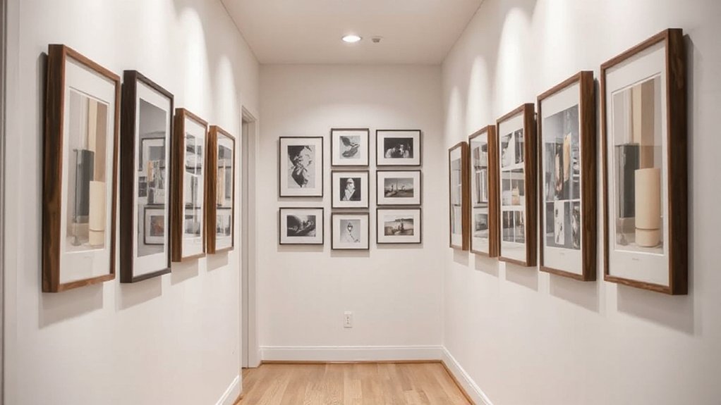
A hallway gallery starts with a clear plan: map out a loose grid that fits the space and eye line. You’ll sketch ceiling-to-floor landmarks and outlet positions to guide placement, then translate them into a grid of frames. Start with a central focal point at about eye level, and align surrounding pieces to form a cohesive rhythm. Measure wall width, note doorway offsets, and account for baseboard depth so each frame sits flush. Use a mix of sizes to create visual interest without crowding, leaving enough negative space for breathing room. Consider digital displays for rotating imagery and themed collections to keep the wall fresh. Keep your layout adaptable, marking swap zones for future updates as your collection grows.
Select Artwork for a Narrow Wall
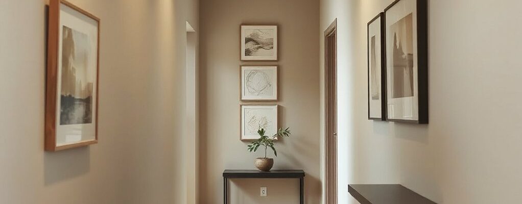
Choose pieces that suit the hallway’s width and light, prioritizing a cohesive gallery style and clear size-and-proportion fit. Opt for a mix of shapes and a consistent frame palette to keep the wall visually balanced without clutter. Start with a core set of larger pieces and fill gaps with smaller accents to guide the eye along the narrow space.
Gallery Style Choices
Wondering which gallery style works best in a narrow wall? You’ll pick a look that feels deliberate, not crowded, by prioritizing cohesion, contrast, and scale. Focus on how art arrangement guides the eye along the corridor, then align frames and finishes to a single mood.
- Use a unifying frame family for a clean, cohesive vibe
- Mix sizes around a central axis to create movement without chaos
- Favor high-contrast pieces to stand out in dimhall light
- Introduce a few vertical or horizontal layouts to mirror wall length
Choose a style—minimal, eclectic, or modern—that supports your space, then repeat key elements for harmony.
Size and Proportion Fit
Size and proportion matter most on a narrow wall: pick artwork that fits the space without crowding it. Start with proportional scaling: choose pieces that relate to the wall’s length and height, avoiding oversized canvases that overwhelm or tiny frames that disappear. Aim for a cohesive rhythm; mix vertical and horizontal works only if they harmonize in scale. Prioritize simple matting and consistent framing to bolster visual balance, not distraction. Consider a central anchor piece, then add two to four supporting works that echo its size or line direction. Leave breathing room between frames to prevent a crowded look and to guide the eye smoothly along the hallway. Preview placements with tape or paper templates to verify flow before hanging.
Measure and Map Your Wall Precisely
To measure and map your wall precisely, start with a quick sketch that captures the hallway’s length, width, and any architectural quirks—doorways, outlets, trim, and crown molding. Then translate that sketch into concrete data using practical wall measurement and mapping techniques that you can trust when hanging art. This approach helps you visualize balance, scale, and spacing before you drill a single hole.
- Measure wall height and width at multiple points to catch uneven surfaces
- Mark key reference points for outlets, switches, and trim
- Note door swing clearances and any architectural nubs or alcoves
- Create a simple grid that guides exact placement and spacing for frames
Choose Frames and Mats for Continuity
After mapping your wall, pick frames and mats that tie the gallery together. Choose frame material that reads cohesive across pieces—steel, wood, or a low-contrast lacquer can unify without competing with art. Keep a consistent edge profile to create rhythm as you move along the hallway. For mats, select a unified mat color that complements your wall and art, then apply it consistently. If you vary frame sizes, maintain the same mat color and inner border width to preserve continuity. Consider a shared white or soft gray mat to brighten and widen the display, or a warm beige if your wall leans toward cream. Remember: balance frame tone with artwork so no single piece dominates. Aim for a streamlined, designed-in-look from end to end.
Hang Art Without Crowding: Spacing Rules
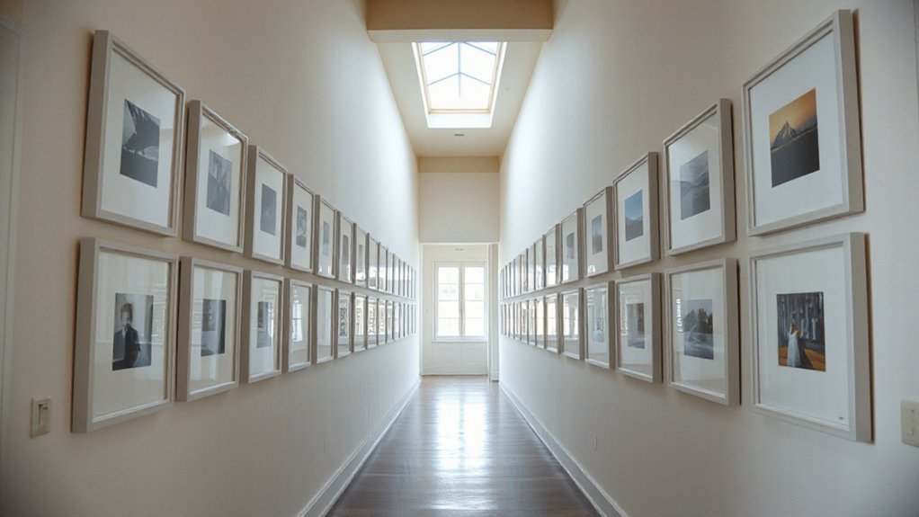
Spacing matters as much as the art you choose: keep a clean rhythm along the hallway by pairing pieces with precise gaps. When you plan, think in increments of 2 to 4 inches between frames to maintain visual harmony and avoid crowding. Rely on consistent frame height and matting to reinforce art placement without creating noise. Use a mock layout on the wall first, then transpose to the real space to prevent misjudgments. Maintain eye level at roughly 57 inches for the main pieces, and stagger secondary works to avoid clustering. This approach keeps the corridor feeling airy rather than packed.
- Map your layout before hanging
- Keep consistent gaps for all pieces
- Align centers with a shared baseline
- Prioritize negative space to breathe visual harmony
Balance Color and Lighting in a Tight Hall
Balance color and lighting by choosing a cohesive hue palette and bright-but-not overpowering illumination. Consider where you place light sources to create even wall contrast without glare, so art pops without washing out tones. Use a mix of natural and ambient light to keep hues true and your gallery feel inviting.
Balanced Hues, Brightness
A narrow hallway benefits from a cohesive color story that enhances brightness without overpowering the space. When you balance hues, you create a calm flow that makes each piece feel intentional and airy. Focus on color harmony across frames, mats, and wall space to keep the corridor feeling larger and brighter, not cluttered.
- Choose a restrained palette that repeats a few key tones
- Opt light-wall brightness by leaning toward soft whites or pale neutrals
- Use a single accent color for cohesion without shouting
- Consider matte finishes to reduce glare and maintain depth
This approach yields a polished, visual-centered gallery. You’ll notice how the sequence of artworks guides the eye, while subtle color echoes unify the display.
Light Sources, Wall Contrast
As you move from a cohesive color story to the glow that frames it, lighting becomes your partner in a tight hall. Choose ambient illumination that bounces softly off walls, revealing artwork without glare. Position fixtures to create even wall wash, preventing harsh hotspots and enhancing wall contrast. In a narrow space, avoid oversized luminaires; slim sconces or recessed LEDs keep sightlines clear while delivering consistent brightness. Use warm or neutral tones for a welcoming, unified feel that doesn’t compete with frames. Dimmers give you flexibility for daytime versus evening viewing, and lamps with adjustable heads let you spotlight individual pieces. Test reflections on glossy surfaces, adjusting angles until shadows fall where you want focus. The result: balanced color and lighting that elevate every piece.
Create a Skinny-Wall Salon Grid
To create a skinny-wall salon grid, start by measuring the hallway and sketching a simple layout on paper. You’ll map a tight grid that feels deliberate rather than crowded, balancing negative space with focused motifs. Keep the spacing even and anchors low to mid-wall for visual rhythm. Think about gallery wall themes and wall texture to unify disparate pieces and finishes. Use lightweight frames for easy adjustments during the setup.
- Align frames to a central baseline for clean lines
- Group art by a common color or motif to read as a single composition
- Mix sizes within a strict grid to add interest
- Preview with removable tape before nailing anything
This approach yields a polished, cohesive display without overwhelming the corridor.
Mix Art Sizes and Orientations Effectively
Experiment with a mix of sizes and orientations to create visual rhythm without chaos: start with a dominant, larger piece anchored at eye level, then intersperse smaller portraits and rectangles to balance negative space. When selecting frames, vary widths but keep a cohesive finish—matte black, brushed metal, and warm wood can coexist if their tones echo the wall color. Arrange layouts on the floor first, mapping a loose grid before committing to nails. Alternate vertical and horizontal pieces to guide your gaze along the hall, creating artistic variety without clutter. Keep matting consistent to unify disparate works, and cluster similar subjects or colors near each other to reinforce visual harmony. A thoughtful rhythm elevates a narrow corridor into a curated, gallery-like passage.
Add Props and Accent Lighting Without Clutter
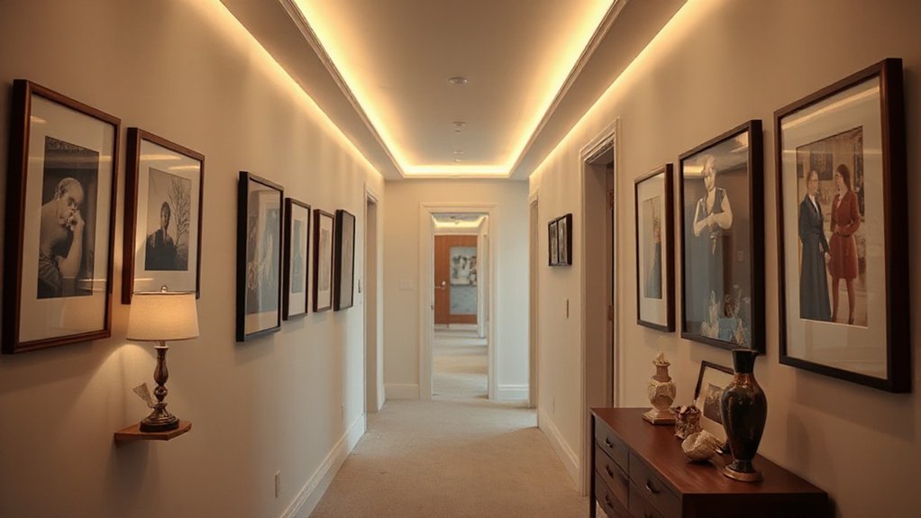
Balanced props and subtle lighting can elevate a narrow hallway without crowding it. You’ll keep the wall clean while adding character with purposefully chosen decorative accessories and discreet accent lighting. Choose items that echo your art scheme and run a single unifying finish for cohesion.
- Layer small, low-profile sculptures with slim frames to avoid bulk
- Use a slim console or wall-mounted shelf to display essentials without clutter
- Integrate narrow LED strip lighting to highlight key pieces and create depth
- Select decorative accessories in a restrained palette to unify the space
Accent lighting should be indirect and placed to cast gentle shadows, not glare. Keep props to a minimum, rotating seasonal pieces to maintain a fresh, curated look.
Troubleshoot Common Hallway Gallery Issues
Even with careful planning, hallway galleries can hit snags. When frames tilt, rehangs feel like a chore, and gaps distract from the overall rhythm, address it with a quick check: level, spacing, and weight. Begin by ensuring lightweight frames stay flush against the wall, then adjust the wire or cleat system to center each piece at eye level. If the corridor feels crowded, swap in a few larger statements for impact, creating a clear focal path. Protect artwork during adjustments with gloves and consider archival hinges to minimize touch. For long-term upkeep, plan regular re-evaluations of gallery lighting so shadows don’t distort colors. Prioritize artwork preservation by avoiding moisture and UV exposure, and maintain a balanced, cohesive display that remains visually breathable.
Frequently Asked Questions
How Tall Should the Gallery Wall Be Placed for Best Sightlines?
Ideal height is eye level placement—roughly 57 to 60 inches from the floor. You aim for eye-level alignment across pieces, adjust for sofa height or seating nearby, and guarantee sightlines flow smoothly along the gallery wall.
Can I Mix Framed and Unframed Pieces in a Narrow Hall?
Yes, you can mix framed and unframed pieces in a narrow hall. Mix styles, texture contrast, and play with alignment; keep color cohesive and spacing tight for a polished, visual-oriented display that feels deliberate and balanced.
What’s the Minimum Space Required Between Frames in a Corridor?
You should allow about 2 to 3 inches of frame spacing between pieces, depending on hallway width. In tight corridors, keep to 2 inches to maintain balance; wider hallways can handle 3 inches for dramatic impact on frame spacing.
How Do I Handle Uneven Hallway Walls When Hanging Art?
Uneven walls? You’ll flatten out the look by using wall texture guidelines and leveling with a string line. Use hanging tools carefully to align each frame, compensate for irregular surfaces, and evenly space pieces for a polished display.
Are Digital Prints Suitable for a Skinny-Wall Gallery?
Yes, digital prints suit skinny walls; they’re crisp and versatile. You’ll protect wall durability with proper hang hardware, spacer mats, and lightweight frames, while choosing high-resolution images for a polished, visual-focused gallery.
Conclusion
As you step back, a quiet tension settles over the narrow hallway—the wall finally breathes. You see the grid lined up, frames harmonized, lights coaxing secrets from each edge. There’s a rhythm you didn’t notice before: larger anchors, nimble fillers, a whisper of props that won’t crowd. You tighten the last nail, pause, and listen to the hallway exhale. The gallery isn’t finished yet, it’s waiting—balancing, ready to reveal what you’ll live with, every day.