You explore classic blue and white as a disciplined, period-aware framework that honors restraint while highlighting architectural detail. The palette steadies room rhythm, using deep indigo and navy as authentic accents against crisp whites on moldings and panels. This approach invites careful material and finish choices—no trendy shortcuts—to preserve historical integrity. Yet the question remains: how will you balance texture, light, and period cues to sustain authenticity as you proceed?
Define Period-Home Charm With Blue and White
Classic blue and white schemes, when applied to period homes, define charm through a careful balance of heritage and restraint. You assess how color choices align with historical accuracy, prioritizing finishes and shades that period sources would have recognized. You consider blue as a tonal anchor—calming, formal, and versatile—while white acts as a crisp reflector that preserves architectural details. You weigh color psychology, acknowledging how lightened walls can expand narrow interiors and highlight woodwork, moldings, and plaster. You document archival precedents, noting era-specific palettes and their social meanings, then translate them into disciplined practice: select authentic pigments, avoid anachronistic saturation, and respect fade tendencies documented in primary sources. This approach yields a cohesive, credible ambiance that honors context without fetishizing ornament.
Choose Traditional Blues That Pair With White
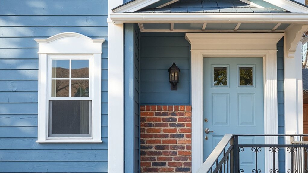
To pair with white, choose traditional blues that grounded period homes historically used, prioritizing authentic saturation and provenance. You’ll find that deep indigo, navy, and muted cobalt anchor rooms without shouting, while mid-tone blues read as durable, era-appropriate surfaces in plaster, wood, and wallpaper grounds. Seek pigments documented in supplier catalogs from the late 19th and early 20th centuries, favoring stable, non-gloss finishes that age gracefully. Use blue as a restrained accent in trim, cabinetry, or upholstery rather than overwhelming walls, preserving the balance between light and form. Contemporary color trends inform but shouldn’t dictate this pairing; instead, let provenance and patina guide your choices. Pairing with white supports Modern interior accents while remaining true to archival, period-aware restraint.
Georgian, Victorian, and Colonial Room Inspirations
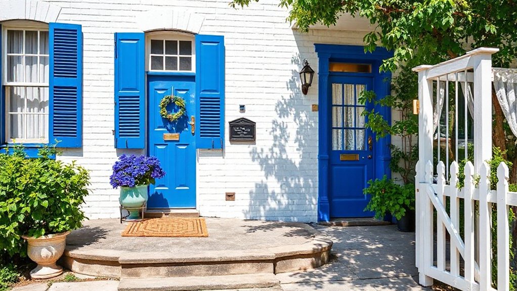
You’ll notice how Georgian blue accents anchor rooms with restrained symmetry, guiding proportions that reflect early 18th‑century restraint. Victorian white pairings introduce brighter surfaces that amplify ornament while preserving legibility of the architectural hierarchy. Colonial room proportions offer a clear framework where color reads as a spatial cue, shaping how blue and white respond to period millwork and proportion.
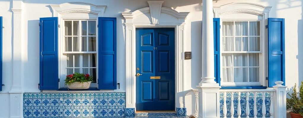
Georgian Blue Accents
If you’re reimagining Georgian spaces, blue accents offer a disciplined yet evocative path that anchors period rooms without overpowering their lineage. In archival terms, blue in early 18th–19th century interiors functioned as a measured counterpoint to carved oak and pale plaster. Focused use of blue accent walls creates visual depth while preserving material honesty, avoiding fashionable sensationalism. Pair with white trim details to highlight moldings, paneled doors, and cornices, preserving the room’s architectural grammar. The effect is rational and restrained, yet palpably literary, recalling cabinet-maker inventories and estate plans that record subtle color as spatial logic. Use blue sparingly, calibrating saturation to avoid fatigue; let daylight temper contrast, ensuring the scheme remains legible across generations.
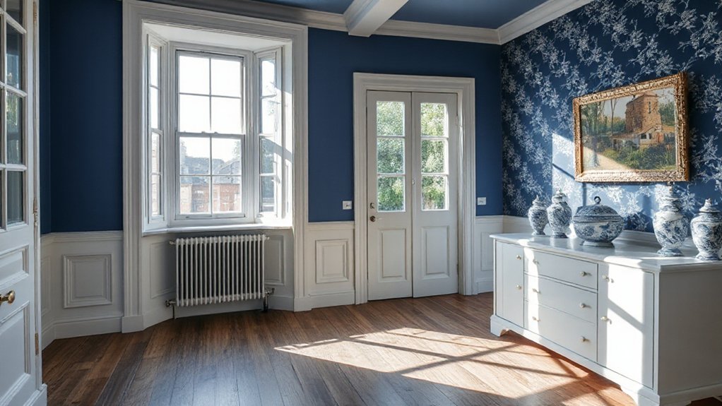
Victorian White Pairings
Victorian white pairings extend the restrained logic of Georgian blue accents into a warmer, more textural palette that suits late-19th century rooms. You notice how white surfaces anchor richly patterned wallpapers, carved wood, and satin textiles, creating depth without overwhelming ornament. In this archival lens, Victorian interiors blend tonal whites with subtle creams, allowing the room’s character to read through surface detail rather than pure contrast. Vintage textiles appear as tactile focal points, from damask drapes to embroidered chair coverings, reinforcing period tactility while maintaining legibility. You’ll also see Modern accents morph into curated highlights—brass hardware, porcelain insets, and glass-backed mirrors—that echo industrial modernity without sacrificing historic resonance. The result remains disciplined, legible, and historically informed.
Colonial Room Proportions
Colonial room proportions fuse Georgian formality with Victorian emphasis on comfort, yielding spaces that read as orderly yet lived-in. You examine how room dimensions calibrate human scale, from narrow corridors to generous, sight-lit parlors, revealing an archival logic: proportion governs use as much as silhouette. In Georgian practice, symmetry guides placement, with clear axis lines guiding furniture arrangement; in Victorian interiors, comfort prompts softer edges and varied sightlines, yet retains measured order. Colonial influences blend these impulses, creating rooms that balance restraint with domestic ease. Garden pathways echo exterior-to-interior shifts, reinforcing rhythm through repeated portals and views. You’ll notice furniture styles shift by era yet maintain blue-and-white restraint, supporting clear sightlines and functional gathering that remains historically legible.
Paint Finishes, Wallpapers, and Wood Tones: Which Combinations Work
When choosing paint finishes, wallpapers, and wood tones for period homes, consider how each element reflects era-appropriate materials and construction practices. You assess surface textures, sheen levels, and the patina of wood to preserve historical accuracy while allowing tasteful contrast with blue-and-white schemes. Finishes should read as authentic, not theatrical, so prefer limewash or lime-based paints, shellac, and low-sheen emulsions over modern glossy lacquers. Wallpapers ought to echo period motifs with restrained scale, and plants or damask patterns can pair with white interiors without overpowering the blue. Wood tones—from ambered oak to softened pine—should balance with wallpaper parity and room light. Faux finishes offer subtle depth, while Modern accessories must remain restrained to maintain archival credibility.
Highlight Architectural Features With Blue and White
Blue-and-white schemes don’t just color walls; they illuminate architectural features by outlining form and guiding the eye to detailing that era builders prized. You’ll see how contrast defines moldings, cornices, and window surrounds, turning quiet surfaces into archival cues. This approach foregrounds proportion, rhythm, and hierarchy, letting period specifics speak clearly.
- Emphasize fixed frames: paneling, fireplace mantels, and staircases gain clarity when set against crisp white to reveal lineage and craft.
- Control light flow: blue accents focus attention on alcoves, transoms, and pilasters, enhancing perceived depth without overpowering.
- Integrate curatorial elements: pair Vintage furniture with restrained Modern accessories to balance historic patina and contemporary clarity.
This strategy preserves authenticity while guiding interpretation of spatial syntax and era details.
Texture and Material Pairings for Depth
Texture and material pairings create tactile depth that complements blue-and-white interiors. You’ll see how contrast in textures—glazed ceramics against matte plaster, or timber grain with soft fabrics—reads as intentional chronology. This approach emphasizes material logic, guiding the eye through period-accurate layers without losing the room’s quiet cohesion.
Texture With Material Pairings
Texture and material pairings create depth by combining tactile surfaces with appropriate finishes, allowing light to play across plaster, timber, brick, and ceramic in period blue-and-white schemes. You assess how texture guides perception, balancing reflective glazes with matte plasters to modulate color and mood. Color psychology informs choice: cool whites calm rooms; warmer undertones invite intimacy; muted blues provide cohesion. Lighting techniques become material agents, revealing grain, patina, and glaze at different times of day. Consider these pairings:
1) Plaster with limewash and brass fixtures for softness and brightness
2) Timber beams with matte ceramic tiles to echo maritime interiors
3) Brick surfaces glazed lightly to preserve historical texture while enhancing contrast
This approach anchors archival accuracy within tactile, color-driven design choices.
Depth Through Material Contrast
Depth emerges when you juxtapose materials with distinct tactile and optical qualities, guiding light and perception across period blue-and-white interiors. You analyze how marble, plaster, wood, and ceramic tile interact with glaze and patina to create perceptual layers that read as spatial depth rather than mere surface. By mixing smooth, reflective finishes with textured or matte ones, you establish a tonal hierarchy that preservesHistorical accuracy while enhancing legibility of architectural fronts, moldings, and furniture silhouettes. Consider color psychology: cool blues recede, warm woods advance, and dark stone anchors corners, yielding a calibrated depth that reads consistently across rooms. Maintain archival rigor by documenting material provenance, finish dates, and installation sequences to support interpretive clarity and enduring period coherence.
Step-by-Step: Applying Blue and White in Each Room
To apply blue and white effectively in each room, start by mapping the scheme to the room’s purpose and existing architectural details, then choose a dominant blue and secondary whites that reinforce period accuracy.
- Assess focal points and align with garden landscapes or interior views, selecting blues that echo outdoor sightlines while maintaining furniture styles consistent with the era.
- Establish a hierarchy: dominant blue on key architectural elements, with whites supporting trims, cabinetry, and textiles for balance.
- Test contrast and texture through finishes, ensuring materials read as authentic and archival rather than trendy.
This method keeps the look precise, room-by-room, preserving period integrity while guiding practical decisions about furniture, textiles, and finishes.
Common Pitfalls and Maintenance You Can Prevent
Common pitfalls in blue-and-white schemes for period homes often stem from overreliance on trendy hues or mismatched era details, which can erode authenticity. You should audit color choices against historical records, noting where modern palettes collide with archival moments. Color psychology matters: blue can read calm in some periods, yet too stark a high-contrast balance may feel anachronistic in others. Maintain historical accuracy by limiting accents to period-appropriate whites, blues, and textures, avoiding contemporary saturations and synthetic finishes. Develop a maintenance plan that prioritizes patina preservation, proper lighting, and surface coatings that reflect era methods. Document updates, repairs, and repaint cycles to track provenance. If you question a pairing, test against archival photographs or manufacturer catalogs before committing, ensuring the scheme remains legible to future historians.
Frequently Asked Questions
How Can Blue and White Affect Room Acoustics in Period Homes?
Blue and white in period rooms can improve sound absorption through soft, matte surfaces, reducing flutter echoes, while bright color reflection minimizes harsh contrasts; you’ll notice subtler reverberation patterns, aiding clarity of speech, with archival-style, color-aware acoustic analysis.
Which Hues Read as Period-Appropriate in Different Lighting Conditions?
You’ll find muted mid-tones read period-appropriate in warm light, while deeper hues suit evening glow; a Historical palette evolves with daylight. Cultural significance shifts: daylight emphasizes clarity, artificial lighting enhances resonance, influencing perceived authenticity and archival accuracy.
Are There Historical Color Regulations or Guidelines for Restoration?
Yes, there are historical preservation color regulation guidelines you must follow, often administered by local commissions. You’ll compare archival records, consult color catalogs, and apply period-aware standards to guarantee restoration complies with established color regulation guidelines.
How to Balance Blue-White With Existing Architectural Details Without Overmatching?
You balance blue-white by prioritizing color contrast and pattern coordination, preserving architectural details while avoiding overmatching; assess textures, light, and period finishes, then apply restrained blues to highlight trims, preventing clashes and maintaining archival integrity.
What Are Budget-Friendly, Authentic-Feeling Sourcing Options for Finishes?
To answer: look for cost effective materials through vintage sourcing options, focusing on period-appropriate finishes. You’ll analyze provenance, authenticity, and wear, prioritizing durable, historically accurate options that remain budget-conscious as you source from reputable archives and suppliers.
Conclusion
You’ll close with a measured nod to history, where blue and white are less flavors than foundations. Think of a Georgian hall, where white trim reveals every curve, and a deep indigo sofa quietly anchors the room like a chapter header. In a study, blue walls recite restraint while grain and patina tell the time. Data shows enduring rooms age best when color stays faithful to tradition, not trendy whims—proof that authenticity compounds charm.