Think of your hallway as a staged entrance, a quiet prelude to every room. You can change the space with bold greens for calm, corals for energy, or deep blues that feel wider. Alternate hues to create rhythm, or repeat a single accent to anchor the view. There’s more to this than color—texture, lighting, and walls that draw you forward will keep the progression vibrant yet cohesive, inviting you to stay curious about the next step.
How Bold Color Transforms Hallways
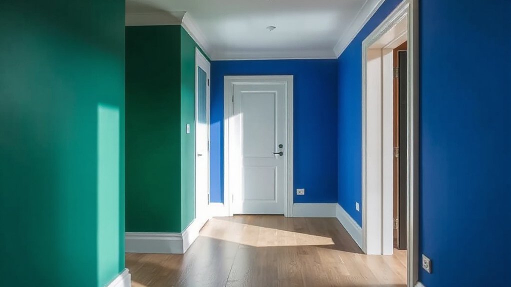
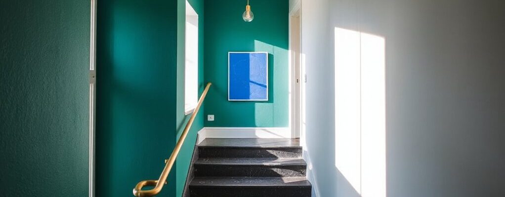
Bold color instantly reshapes hallways, turning narrow passageways into confident, expressive spaces. You’ll notice doors, art, and trim gain personality as color acts like a cue, guiding your gaze along each corridor. Color psychology informs your choices: deep greens calm shiftings, saturated corals energize arrivals, and cool blues expand perceived width. You’ll create visual rhythm by alternating hues or repeating accents at regular intervals, so movement feels intentional, not random. You’ll test tonal ladders—one base shade with two supporting tones—to maintain harmony while keeping intrigue. Contrast is your friend: a bold wall against light molding or vice versa sharpens edges and adds depth. In practice, plan lighting to complement pigment shifts, ensuring reflections amplify rather than distort your chosen palette.
Build Your Hallway Palette: A Step-by-Step Plan
Now that you know how bold color reshapes a hallway, you’ll map a practical palette that moves with purpose. Start with a dominant shade grounded in color psychology—choose a hue that aligns with mood goals (calm, energizing, welcoming). Pick two supporting tones: one lighter for ceilings and trim, one richer for statement walls or a single accent panel. Limit accents to three vibrant pops, like an accent rug, a obraz of art, or a bold door color. Test samples in lighting at different times of day, then refine until harmony emerges. Document ratios as a quick rule: 60% base, 30% secondary, 10% accents. Finally, note accents accessories that reinforce the palette without overwhelming it, ensuring a cohesive, modern corridor.
Wall Treatments for Narrow Corridors
For narrow corridors, wall treatments should maximize perceived width without sacrificing texture or warmth. You’ll lean into light, reflective surfaces to open the space while adding tactile interest with subtle, inexpensive textures. Consider pale, cool neutrals as a base to encourage airiness, then punctuate with strategic color blocks at sightlines to guide movement. Paint or wallpaper with fine graining, or a satin finish that catches light without glare, preserving depth. Use vertical patterns sparingly to elongate the wall without narrowing it; decoupage or panels can add dimension without bulk. Color psychology informs your choices: soft blues and warm whites evoke calm and openness, while gentle greys anchor space. Remember space perception: keep trims slim, seams minimal, and transitions seamless to preserve coherence.
Lighting and Texture to Elevate the Feature Wall
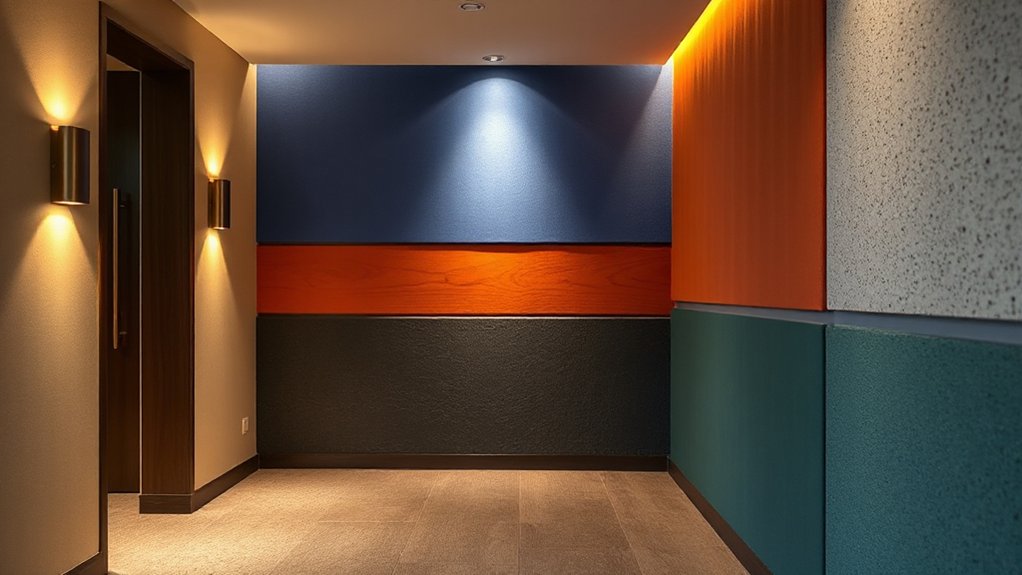
Lighting and texture play key roles in elevating a feature wall, especially after establishing a calm, airy corridor. You’ll pair accent lighting with bold textures to sculpt depth, guiding the eye along colour and form. Choose warm, directional light to highlight texture without glare, then let a textured finish refract glow into the surrounding space. The right balance makes the wall feel intentional, not busy.
- accent lighting spots highlight architectural detail and create mood
- textured finishes add tactile interest and depth
- subtle shadows sculpt dimension, enhancing colour
Keep cues cohesive: match light warmth to wall tones, and select textures that play with scale. The result is a feature wall that feels curated, modern, and inviting.
Durability, Flow, and Low-Maintenance Hallways
Durability and easy upkeep aren’t afterthoughts in a busy hallway; they define how long your stylish moment lasts. You’ll want surfaces that resist scuffs, fingerprints, and daily wear without shouting “maintenance.” Start with color psychology to pick hues that hide wear and boost mood; medium-tone neutrals paired with an accent color offer flexibility as trends shift. Choose paint finishes that balance washability with depth—matte masks imperfections, while satin or eggshell adds subtle sheen for light bounce. Flooring should flow with the walls, creating visual continuity that feels intentional, not cluttered. Prioritize seamless progressions, durable trims, and minimal grout lines to simplify cleaning. Pair smart storage with thoughtful lighting to guide movement, preserve flow, and reduce maintenance overhead over time.
Frequently Asked Questions
How Do I Choose Bold Colors for East-Facing Hallways?
Choose bold colors by balancing color pairing with daylight. East-facing hallways gain warmth from morning light, so pair vibrant hues with cooler accents. Use lighting effects to intensify depth, and test swatches in natural and artificial lighting.
What Budget Ranges Work Best for Bold Hallway Features?
You’ll find that $200–$1,000 per hallway is a sweet spot, balancing impact with practicality; color psychology guides your mood shifts, while paint application techniques maximize depth and texture, letting bold hues read refined rather than loud.
Can Bold Colors Affect Hallway Acoustics or Echo?
Color psychology suggests bold hues can influence perception, but they don’t magically fix acoustics; use sound-absorbing treatments for real impact. You’ll notice improved sound absorption, while colors subtly shape mood and space dynamics.
Which Pigments Resist Fading in Bright Hallway Lighting?
You’ll want pigments that resist fading; look for color longevity and pigment durability in architectural paints. Choose high-quality inorganic pigments, UV-stabilized resins, and matte or satin finishes to keep bright hallway tones vibrant over time.
How Often Should I Refresh Bold Hallway Accents?
Refresh bold hallway accents every 1–2 years; coincidence nudges you toward keeping trendy while your space breathes. You’ll leverage color psychology and lighting considerations to stay fresh, cohesive, and visually striking as trends shift.
Conclusion
So you’re about to paint the hall with fearless color—how novel. You’ll love the drama, then grit your teeth when the cat refuses to acknowledge the coral, and the hallway somehow looks longer even after you swore you’d never do tonal ladders again. But hey, that’s the beauty of bold walls: they pretend to be simple, then demand a legend. You’ll walk through, gloss in hand, knowing this feature wall is your quiet rebellion—nicely executed, right down the corridor.