Statement wallpaper can boost value when you use it strategically: create focal walls in living rooms or entryways, keep patterns moderate in hallways, and opt small, repeat-free motifs in compact baths or kitchens. In bedrooms and home offices, lean toward calm, cohesive patterns that support focus and rest. Avoid bold, dense prints in tight spaces or on all walls, which can shrink perceived space and deter buyers. Want more detail to tailor your approach? You’ll find practical guidance here.
Living Rooms: Where Statement Wallpaper Shines
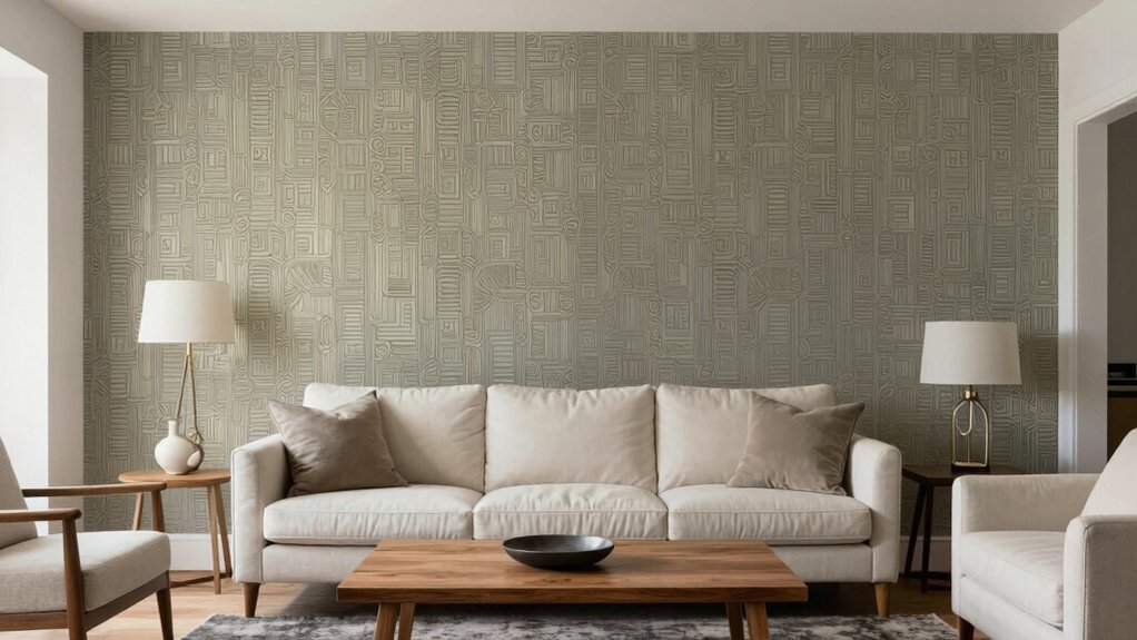
Statement wallpaper instantly elevates living rooms by establishing a focal point without overwhelming the space. You’ll see the room read as intentional, guiding traffic and attention toward a single feature. In rooms with neutral bases, a bold print adds personality without clutter because the backdrop remains calm.
Data show higher perceived value when a design element acts as a visual anchor, reducing stylistic noise. Choose scalable patterns: smaller motifs fit compact spaces; oversized prints work in larger layouts with adequate wall area. Pair with complementary neutrals to maintain balance, avoiding competing patterns on adjacent walls.
Texture matters: matte finishes lessen glare, while subtle raised textures can add depth without sacrificing legibility. Measure, preview, and adjust height to ensure a cohesive, premium feel.
Bedrooms: Balancing Calm and Bold Patterns
You’ll balance calm and bold patterns in the bedroom by pairing soothing neutrals with a single statement motif.
Data shows calmer rooms feel more restful, while an accent pattern adds personality without overwhelming the space.
Start with a dominant color and test one bold pattern at a time to measure impact on mood and sleep quality.
Calm vs. Bold Patterns
Calm and bold patterns each serve distinct roles in bedroom design, and balancing them depends on room size, natural light, and personal style.
In smaller bedrooms, opt for calm patterns on large surfaces to preserve openness, then introduce a single bold accent—like a statement pillow or a feature wall—to create focal energy without overwhelming the space.
In larger rooms, you can layer multiple patterns, but maintain a coherent palette to sustain cohesion and avoid visual fatigue.
Patterns with high contrast read as bold; softer, low-contrast repeats feel calm.
Consider bed linens for immediate impact, with curtains, rugs, and artwork reinforcing a consistent temperament.
Test alternatives with fabric swatches and lighting simulations to quantify perceived balance before committing.
Bedrooms: Pattern Balance
Balancing calm and bold patterns in a bedroom hinges on proportion and rhythm. When you mix prints, limit bold, high-contrast motifs to a single feature wall or a duvet set, keeping the rest solid or subdued.
Patterns occupying 15–25% of wall area or textile coverage typically deliver energy without overwhelming the space. Use a calm base color and repeat a secondary accent hue across accessories to create cohesion.
Scale matters: pair large motifs with small repeats to avoid visual chaos; alternate directions to reduce pattern fatigue. Test lighting conditions; soft, even light enhances subtler prints, while harsh light exaggerates contrast.
Data shows balanced patterning correlates with higher perceived calm and buyer appeal.
Kitchens and Dining Areas: When Wallpaper Works
Kitchens and dining areas can benefit from wallpaper when used thoughtfully, because the right pattern adds personality without sacrificing practicality. In these spaces, choose washable, stain-resistant finishes and light-reflective tones to maintain a bright, clean look under daily use.
Data shows that subtle textures or geometric motifs can boost perceived value by signaling modern taste without overwhelming cabinets or counters. Pair wallpapers with durable backsplashes and moisture-resistant paints to minimize maintenance and maximize lifespan.
Use restrained palettes—two to three colors top to bottom—to preserve flow, especially in open layouts. Consider feature walls in dining zones to create focal points without overpowering eating nooks.
Finally, test patterns in small swatches under varied lighting to predict real-world impact before full installation.
Bathrooms: Small Spaces, High Impact Choices
Bathrooms present limited wall area but high visual impact. You’ll maximize value by choosing wallpaper that enhances perceived space and moisture tolerance. Opt for small, repeat-free patterns or light-toned prints to create airiness and reduce visual clutter.
Data shows buyers prefer vinyl or coated options with strong washability ratings in wet environments, lowering maintenance concerns. Use bold accents sparingly—one focal wall or a waterproofed band at splash zones—so you don’t overpower the room.
Partnerships between pattern scale and room size matter: large rooms benefit from mid-scale motifs, while compact baths gain from micro-patterns that read as larger space. Consider matte sheens to minimize glare and mold-friendly substrates.
Finish with complementary fixtures and trim to maintain coherence and resale appeal.
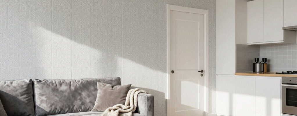
Entryways and Foyers: First Impressions With Pattern
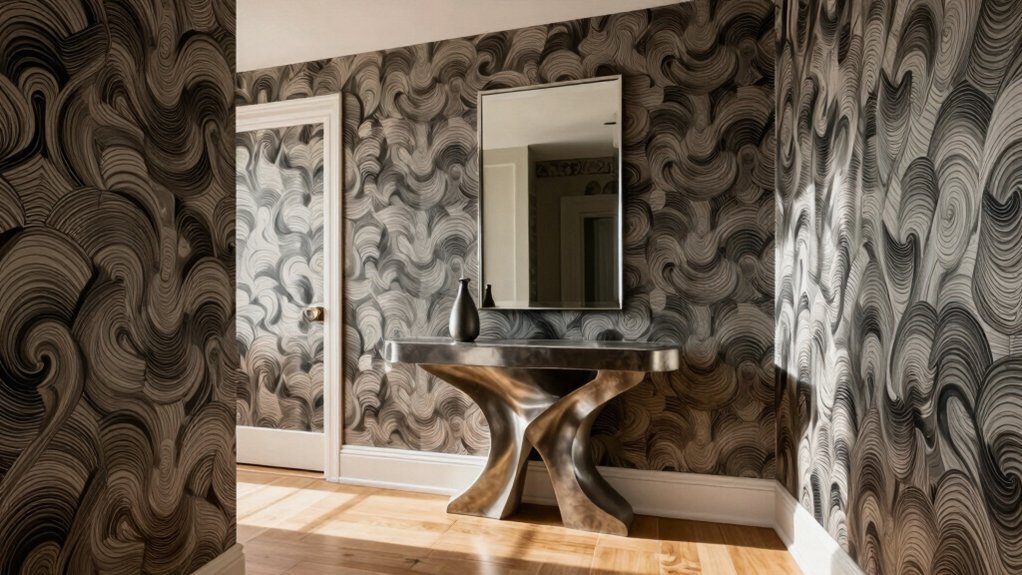
Entryways and foyers set the tone the moment guests arrive, and pattern choices should reinforce a welcoming, spacious entry. You’ll see data favor larger-scale patterns near the door, which visually expands the space, while subtle repeats minimize visual clutter.
A bold, high-contrast wallpaper can signal style confidence, but it may deter buyers seeking neutrality; balance with midtone neutrals to maximize appeal. In high-traffic entries, consider washable inks and vinyl options for durability, reducing maintenance overhead.
Patterns that echo architectural lines—tile, molding, or stair rails—create cohesion, boosting perceived value. Avoid busy motifs in rooms under 12 feet square, which can feel cramped.
Finally, test samples in natural light at multiple times of day to verify dimension, tone, and overall market readiness.
Home Offices: Creative Focus or Visual Noise
You’ll weigh Creative Focus against Visual Noise as you design a home office, aiming for clarity without clutter. Data suggests that balanced textures and purposeful color boosts focus, while excess pattern can distract.
Your goal is to maximize Office Space Versatility without sacrificing productivity. Start by quantifying how each element affects workflow, then adjust to keep the space adaptable for work, meetings, and creative tasks.
Creative Focus Clarity
Creative Focus Clarity hinges on prioritizing essential visuals and reducing distractions in a home office. You should curate wallpapers that reinforce work zones, not compete with task cues.
Data shows that simple, muted patterns correlate with higher focus scores and faster task completion. Avoid high-contrast motifs on primary work walls, which can trigger cognitive load and slow decision making.
Instead, favor linear textures or subtle gradients that soften glare and preserve daylight cues. Consistency across adjacent spaces aids navigation, minimizing visual toggling when you switch tasks.
Measure impact by timing routine activities before and after wallpaper changes, tracking perceived interference and productivity.
Precise, restrained selections help you sustain deep work without sacrificing personality or brand voice in your workspace.
Visual Noise Balance
Visual noise in a home office should be managed, not eliminated; too much texture or color can compete with focus cues, while too little can feel sterile and disengaging. You should aim for balance that supports concentration without dulling personality.
Data shows buyers value rooms that feel organized and legible at a glance; excessive wallpaper patterns or bold contrasts often raise perceived clutter. Opt for a dominant neutral base paired with purposeful accents that can be updated seasonally.
Visual noise should be localized—one wall, a narrow rug, or a curated art cluster—so the space remains legible on quick scans. Subtle repetition of color and texture reinforces calm, not chaos.
Measure impact with simple cues: time-to-task, perceived organization, and ease of navigation.
Office Space Versatility
Office Space Versatility hinges on balancing creativity and calm so you can switch between focused work and informal collaboration without reorganizing your room. You’ll want a layout that supports both tasks, with zones defined by placement and lighting rather than walls.
Data shows productive home offices use modular furniture, adjustable desks, and muteable acoustics to reduce distractions. Keep clutter under 10% of surface area, and prioritize visual simplicity to lower cognitive load.
When you pivot to brainstorms, a whiteboard or glass panel should be visible from your primary desk without rearrangement. Color palettes under 3–4 neutral tones with a single accent boost perceived calm and focus.
Invest in ergonomic seating, high-contrast displays, and smart storage to preserve continuity between modes.
Hallways and Nook Areas: Using Subtle Repetition
Hallways and nook areas gain impact when you repeat subtle elements with purpose, guiding the eye without overwhelming the space. Subtle repetition creates a cohesive rhythm that buyers notice in quick scans. Use a restrained palette, repeating two to three tones across trim, textiles, and small art, then keep patterns minimal to avoid fatigue.
Research shows consistent color families in corridors correlates with perceived flow and higher appraisal, while abrupt shifts reduce perceived value. You can introduce a single motif—a linear stripe, a geometric accent, or a nature-inspired print—across different wall panels, runners, and cushions to reinforce continuity.
Measure impact by time spent looking down the hallway during virtual tours; longer engagement suggests successful repetition without clutter. Prioritize balance, precision, and purposeful consistency.
Open Plan Spaces: Managing Flow and Cohesion
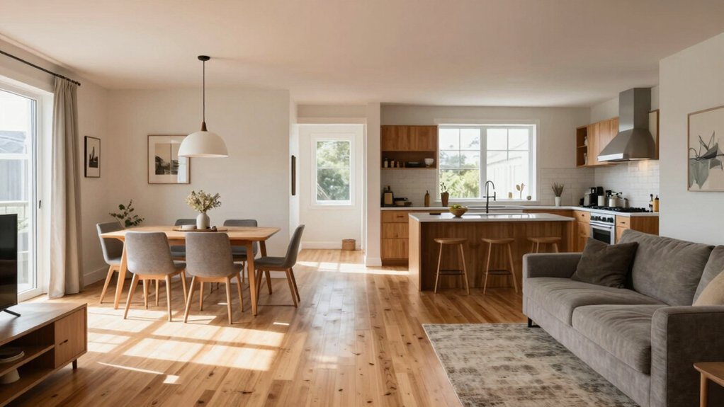
Open plan spaces present unique challenges for flow and cohesion: when zones blend into one another without clear delineation, buyers perceive the layout as chaotic and less functional. You should design distinct functional anchors—kitchen, dining, and living—while preserving sightlines.
Research shows clear zoning reduces confusion and increases perceived value by up to 18%, especially in open kitchens adjoining living areas. Use furniture placement, area rugs, and lighting contrast to define spaces without walls, guiding traffic and signaling purpose.
Maintain porosity for natural light and ventilation, but avoid long sightlines that flatten the space. SMART (storage, movement, accessibility, rhythm, texture) cues improve cohesion; make sure transitions are intentional, not accidental.
Test layouts virtually, then adjust before finalizing finishes or artwork decisions.
What Buyers Really Look For in Patterned Walls
Patterned walls win buyers when the pattern supports the room’s function and rhythm. You should look for scale that matches space: large motifs in open areas feel bold, small repeats suit tight rooms without overwhelming.
Contrast matters: light backgrounds with subtle textures read as spacious; dark backdrops can anchor a dining or media wall. Pattern density should align with lighting; high-contrast designs benefit from natural light to avoid feeling claustrophobic.
Repeat consistency matters too: seamless progressions prevent visual fatigue, while abrupt breaks can signal planning flaws. Consider the room’s furniture and art—patterns should complement, not compete with, focal points.
Durability and maintenance count; washable finishes and color-fast inks hold value longer, minimizing buyer concern about renovation costs. In short, buyers favor balanced, purposeful, low-risk pattern choices.
Conclusion
So, you’ve seen where wallpaper makes a room pop and where it might stall buyer interest. The data lean toward balanced patterns, cohesive color schemes, and suited contrasts that don’t overpower small spaces. Choose carefully for kitchens, baths, and open-plan areas to avoid buyer hesitation. Ready to decide: will your wall choices boost flow, or distract from function and light? If you want value, test scale, restraint, and consistency—then let the right texture seal the deal.