
Matching wall paint matters because it creates a coherent mood you feel every day. You’ll shape undertones to harmonize walls, trim, and furniture, so shifts in light don’t throw the palette off. Testing under natural and artificial light reveals true color behavior, prevents subtle mismatches, and keeps surfaces looking intentional. A unified sheen and thoughtful neutrals add depth, texture, and stability. If you keep exploring, you’ll uncover how to nail this harmony step by step.
Why Matching Paint Matters for Your Space
Matching paint matters because the color you choose sets the tone, influences mood, and unifies the room’s elements. You’ll notice how a single shade can tell a story across walls, trim, and cabinetry, guiding your furniture choices and accessory selection.
To make smart decisions, reference the color wheel to understand relationships among hues and how they interact under light. By selecting complementary hues, you create contrast that reads as intentional rather than accidental, sharpening architectural features and highlighting focal points.
Precision matters: test swatches on multiple surfaces, observe under various daylight conditions, and compare against fabric samples. This approach minimizes guesswork, aligns aesthetics with function, and yields a cohesive, purposeful space you’ll enjoy daily.
How Undertones Drive Room Harmony
Undertones are the hidden harmonizers in paint, shaping how colors read across walls, trim, and furnishings. You don’t just pick a shade; you align its undertone with the room’s dominant hues to foster coherence. When undertones match, subtle shifts in light don’t disrupt mood, they reinforce it.
You’ll notice how cool whites push contrast with warm woods, while warm grays tuck trim into the background, preserving flow. To predict harmony, consult undertone guides, mapping each color’s core warmth or coolness against your palette.
Build complementary palettes by pairing hues whose undertones counterbalance or reinforce each other, not merely by surface color. This disciplined approach prevents jarring passages and enables flexible room adaptations as furnishings or lighting change over time.
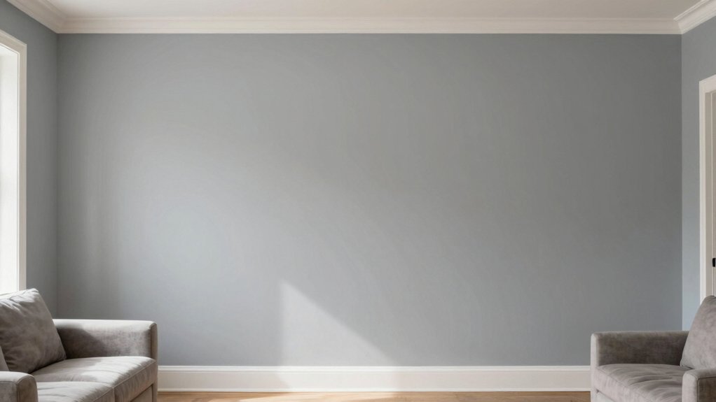
How Lighting Reveals True Colors
Lighting doesn’t just illuminate a room; it reveals how color truly behaves. You’ll notice walls look different under natural sunlight, where cool and warm tones shift subtly as the sun moves.
In artificial lighting, color shifts become sharper: LEDs often emphasize cool undertones, while incandescent warmth can nudge hues toward amber. You should evaluate samples at multiple times and lighting conditions, observing how undertones respond rather than how they appear in isolation.
Color accuracy hinges on color rendering indices and Kelvin ratings chosen for spaces you inhabit most. When you plan paint across rooms, consider which lighting dominates each area: natural sunlight for daytime rooms, artificial lighting for evenings.
This awareness prevents mismatched palettes and preserves true color relationships.
Color Psychology: What Your Palette Says About Mood
Color psychology links hues to mood with practical clarity: the colors you choose don’t just decorate walls—they influence perception, energy, and emotion in a room. When you select a palette, you’re signaling intent and shaping experience.
Color symbolism matters because hues carry culturally learned meanings that guide first impressions and ongoing impressions alike. Warm tones often elevate mood and sociability, while cool shades tend to promote focus and calm.
You’ll notice how saturation shifts perceived intensity and how contrast affects readability and pace of a space. The mood influence isn’t mystical; it’s perceptual, rooted in human cognition and associations.
Use intentional pairings to balance activity with rest, ensuring the environment supports the tasks and interactions you want to foster.
Pick a Neutral That Feels Rich (Not Flat)
Neutral undertones matter to keep walls from looking flat, so you’ll notice depth when the undertone aligns with your space.
Aim for richness without shine, choosing finishes and lighting that reveal texture instead of glare.
Perception shifts with texture, so even subtle contrast in surface feel can intensify the color’s presence.
Neutral Undertones Matter
When choosing a neutral, aim for depth rather than flatness; a rich undertone can elevate a room from bland to restorative. You’re selecting undertones that weave into your overall color palette, not pretend they vanish.
A genuine neutral reads as warmer or cooler depending on adjacent hues, lighting, and texture. Consider how wall texture interacts with pigment; a matte finish may emphasize subtle warmth, while a satin sheens shifts perception toward coolness.
Test chips in multiple lighting moments to reveal shifting undertones, avoiding grayish dullness. Prioritize undertones that harmonize with key pieces and architectural details.
Richness Without Shine
A rich neutral isn’t about gloss or glare; it’s about depth that reads warm or cool depending on nearby tones and lighting. You aim for a color depth that feels substantial without shouting. Choose hues with subtle shifts in undertone, so the wall reads as dimensional rather than flat.
A matte finish amplifies this effect by absorbing light rather than reflecting it, giving you a controlled, refined presence. In practice, test swatches at multiple times of day to observe shifts and ensure harmony with furniture, flooring, and artwork.
Avoid high-contrast pairings that fragment the room’s coherence. The goal is understated gravitas: a wall that anchors the space, yet remains quiet, versatile, and timeless. This approach maintains visual richness while preserving calm, cohesive balance.
Texture Affects Perception
Texture subtlety changes how a neutral feels on the wall — it isn’t just color, it’s perception shaped by finish. You’ll notice how texture alters mood and depth: subtle surface variation can read as warmth, while more pronounced texture reads as rugged or refined, depending on the room’s lighting.
This isn’t superficial; it’s about how light interacts with material, creating cues you subconsciously interpret. You’ll evaluate through tact—touch and sight—to judge how the wall communicates ambiance.
Surface variation matters because it governs glare, shadows, and refinement, steering perception without changing the pigment itself. Recognize material difference: the same paint in satin will feel different from matte or eggshell, even at identical tones.
Choose the texture that aligns with your space’s intent, not just its color.
How to Coordinate Paint With Furniture, Art, and Accessories
Do you want a cohesive look that feels intentional rather than accidental? Start by establishing a dominant color from your wall, then align furniture, art, and accessories to that baseline.
Use color blending deliberately: choose one or two supporting hues and repeat them across textiles, frames, and decor so every element echoes the wall. Prioritize contrast through value, not color, to avoid flatness; a lighter sofa against a mid-tone wall can read as curated rather than coincidental.
When selecting art, prefer pieces that pick up your core hues and introduce a subtle accent. For accessories, practice accessory coordination by curating small groups that mirror your palette, avoiding random scatter.
This disciplined approach yields a balanced, intentional environment without overmatching.
Common Mistakes That Break Cohesion: and Fixes
When you mix paint colors, you risk jarring contrasts or muddy shifts that break cohesion. Watch for color mismatches between walls, trim, and accents, and fix them with a deliberate palette and tested samples.
Consistent finishing touches, from sheen to edge crispness, keep the room looking intentional rather than patched.
Paint Color Mismatch Pitfalls
Color mismatches derail a design quickly, so identifying common pitfalls early helps you keep cohesion intact. In practice, overreliance on a single paint chip without viewing it under room lighting invites drift between walls and trim. Don’t treat a color swatch as gospel; test it on a large sample board and observe under morning and evening light.
Uniform undertones matter: warm bases can lean orange, cool bases toward blue or gray, creating tension if used inconsistently. Avoid mixing brands or sheen levels without reconciliation—gloss reflects differently and skews perception. When uncertain, compare adjacent panels side by side, not just in isolation.
Document decisions with a swatch grid, annotate lighting conditions, and revisit after a week. These steps prevent subtle mismatches from undermining the overall harmony.
Finishing Touch Inconsistencies
Finishing touch inconsistencies can silently derail cohesion if trim, walls, and accents don’t share a unified finish and level. You’ll undermine the design’s intent when sheen, texture, or brightness diverge between components.
Start by selecting a single sheen family for all major surfaces, then apply consistent base coats to prevent glow shifts.
Color blocking demands precise calibration; mismatched block edges create visual jags that pull attention away from the room’s purpose.
Accent walls should echo the overall palette, not compete with it, so keep saturation within a deliberate range.
Avoid stacking multiple finishes on adjacent surfaces—reserve gloss for highlight details only.
Test color and sheen under natural light, and correct early inconsistencies before final coats.
When aligned, color blocking and accent walls reinforce a cohesive, refined space.
A Step-by-Step Paint-Matching Checklist for Your Space
A solid paint match starts with a clear plan: identify the space, the lighting, and the mood you want to create, then assemble the exact swatches and tools you’ll need.
Start with a quick survey: measure the wall size, note nearby accents, and log existing finishes. Use the color wheel to understand relationships—complementary, analogous, and triadic schemes—and pick a base that harmonizes.
Gather swatches, griding tests, and a clean, neutral primer. Test under both bright and dim lighting to reveal true undertones, and evaluate in context with furniture and textiles.
Decide on a paint sheen that suits traffic and maintenance. Document your choices, label samples, and create a mini palette for consistency across rooms, ensuring a confident, deliberate, repeatable result.
Frequently Asked Questions
How Often Should You Repaint to Maintain Color Harmony?
Repaint every 4–7 years to maintain color harmony, adjusting for sun exposure and wear. Monitor color fading and plan touch up frequency as needed; you’ll preserve depth, avoid mismatch, and keep walls cohesive throughout the space.
Can Different Brands’ Paints Match Exactly in Color?
No, different brands won’t match exactly; paint consistency varies, and brand color variations exist. You’ll notice subtle differences even with matched swatches, so test them in your space and adjust with blends or primers where needed.
Do Matte and Satin Finishes Affect Color Perception Differently?
Matte and satin finishes subtly shift color; they don’t change hue, but reflect light differently. You’ll notice finish comparisons in texture, while lighting effects emphasize depth. Finish comparisons reveal subtle nuances, and lighting effects illuminate those distinctions with precision.
How Do Exterior Lighting Changes Affect Interior Color Choice?
Exterior lighting shifts interior color perception; you’ll notice cooler or harsher tones indoors as daylight changes. Plan with layered lighting and sample paints under varying conditions to guarantee the interior color stays true across times.
Is Color Sampling on Walls More Accurate Than Swatches?
Color sampling on walls can be more accurate than swatches, you’ll detect color consistency across lighting, edges, and finishes; it reveals finishing effects and subtle shifts that swatches miss, guiding you toward stable, harmonious results.
Conclusion
You’ll open harmony in minutes when undertones align, lighting reveals true color, and your neutrals feel rich, not flat. Trust why color psychology matters, because mood follows pigment. Coordinate paint with your furniture and art, and avoid stubborn mismatches by sticking to a tight palette. Do this with a clear step-by-step checklist, and you’ll dodge chaos before it starts. It’s not just decorating—it’s design precision that upgrades every room, instantly, to legendary status.