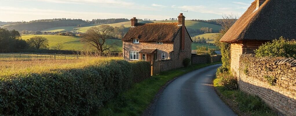
The hedgerow at dawn is a quiet map, guiding you toward colours that settle like moss on stone. You’ll notice weathered neutrals, mossy greens, and misty greys nudging against warm browns, with sunlit yellows flirting near the edges. The texture of linen and clay invites touch, while the air carries a calm that suggests time slows. If you pause here, you’ll sense a path to spaces that feel both timeless and deeply personal, waiting for your next quiet choice.
Core Principles Behind the Countryside Palette
The countryside palette hinges on balance: you’ll notice earthy neutrals—greys, stone, and warm browns—grounding brighter greens and soft, misty blues. You sense the core principle as a careful tension rather than a clash, where contrast serves harmony. You’ll see Wildflower inspiration guiding pops of color without shouting, while Weathered wood tones anchor spaces with quiet, tactile fidelity. Variation exists not to overwhelm, but to mimic seasons’ rhythms—sunlit highlights tempered by shade, texture following form. Subtle shifts matter: a chalky veil over green, the warmth of a cedar edge, the coolness of slate. You curate palettes that breathe, inviting drift between field and hearth, so rooms feel connected to land, weather, and time.
Soft Greys and Moss: The Misty Green Duo
Soft greys sweep in like morning mist, setting a calm backdrop for the mossy greens to breathe. You’ll notice the harmony in Misty Green Hues paired with Soft Grey Accents, each shade quiet enough to let texture speak. Mossy Texture Pairings emerge as tactile anchors, inviting you to feel the landscape in color and contrast.
Misty Green Hues
Even as mist clings to hedges and stone, the Misty Green Duo gathers—soft greys threaded with moss, a quiet counterpoint to daylight. You move through a landscape where hazy tones hint at memory and season, inviting restraint over showy contrast. Mist inspired color symbolism threads its way into your choices: calm resilience, subtle renewal, a belief that cohesion emerges from restraint. In practice, you explore Green paint application techniques that lay a tacit foundation—thin glazes layered over textured undercoats, edges softened, gradual shift kept feather-light. You observe how the palette breathes with dusk, how each surface reads as weathered rather than finished. The result remains understated, versatile, and enduring—an ambient field where light, air, and moss collaborate rather than compete.
Soft Grey Accents
Soft grey accents sit quietly beside moss—an inkling of the Misty Green Duo that doesn’t shout but soothes. You notice how this pairing softens strong lines, invites quiet corners, and tempers daylight with a velvet hush. In rooms, soft greys mingle with moss tones to create a backdrop that lets vintage furniture breathe, their carved edges and patina elevated by restrained contrast. You’ll find the palette translates shops, libraries, and cottages into calm, contemplative spaces. Botanical illustrations gain depth here, their delicate lines breathing against the misted backdrop, each page a whisper of restraint. You prefer restraint over flash, and the effect feels timeless, navigable, and honest—like a well-tuned instrument that plays softly through the countryside air.
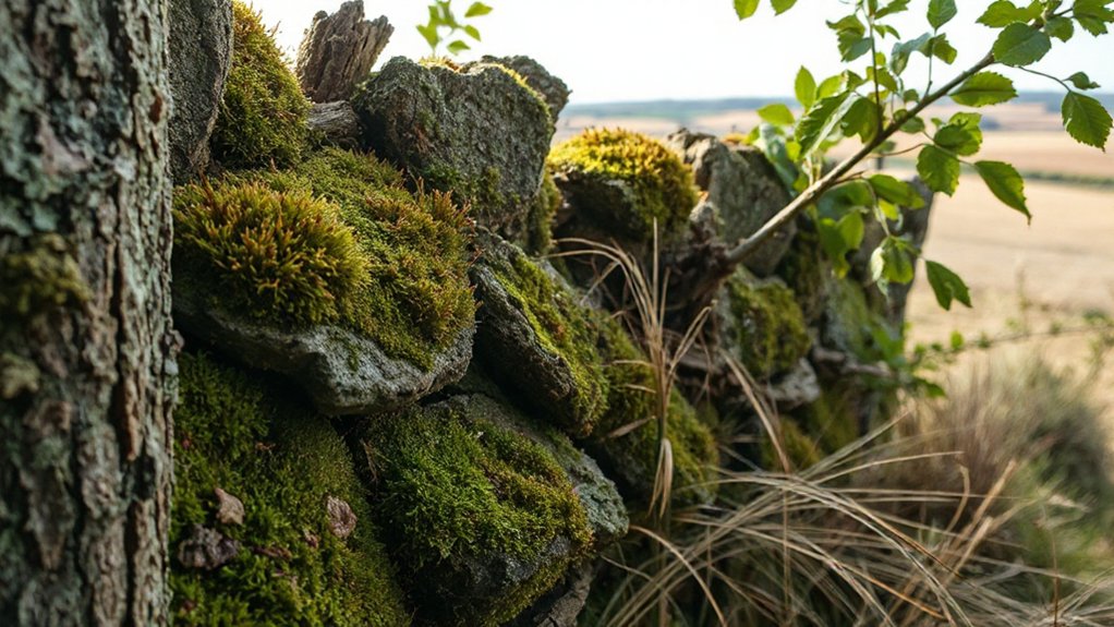
Mossy Texture Pairings
Mossy textures mingle with soft greys to create a quiet, tactile landscape where fabric, wallpaper, and timber carry the same damp, woodland hush you feel outside. You pair mossy linens with linen-woven greys, letting the damp hue deepen as evenings lengthen. The moss green invites a restrained, rustic charm that never screams, instead whispers. In rooms with exposed beams, the pairing holds its ground, aligning with stone and brick for a cohesive, earthy echo. You’ll notice how floral inspiration threads through patterns: subtle sprigs on upholstery, faint leaf motifs on curtains. This duo absorbs light differently, so you’ll curate accessories to reflect warmth without overpowering the mood. The result is calm, grounded, and quietly sophisticated.
Sunlit Yellows and Dusty Blues for Country Charm
You notice how sunlit yellows warm stone walls while dusty blues cool the hedgerows, each shade brushing against the other in gentle contrast. This countryside balance binds significance with memory, inviting you to test how these hues age gracefully on fabrics, fences, and skies. As you explore, the palette reveals a quiet harmony that feels both bright and weathered, ready to shape a timeless country charm.
Sunlit Yellow Hues
Sunlit yellows spill across the countryside like a quiet invitation, tempered by dustier blues that keep the mood grounded. You notice how sunlit yellow hues drift over hedgerows, drying dew on pale grasses as the day loosens its grip on night. The air feels bright without being harsh, a gentle nudge toward activity without hurry. In this moment, countryside awakening reveals itself in small rituals: a churchyard stone catching light, a muffled farmer’s shout from a distant field, a lacy curtain of dust motes rising with a passing car. You sense warmth layered with restraint, cheerful yet sober. The palette invites you to measure time by sunbeams, not clocks, shaping rooms and landscapes with quiet optimism.
Dusty Blue Accents
Dusty blue accents thread through sunlit yellows, like quiet punctuation that steadies a cheerful sentence. You’ll notice how the palette borrows from weathered cottages and hedgerows, where blue shutters soften brick and stone with a quiet resilience. This pairing invites a tempered mood: misted mornings, long shadows, and the faint glint of metal on gate hinges. Historical color influences echo in the depth of pigment, lending an aged confidence to modern rooms. You can weave dusty blues into walls, trim, or furnishings without losing lightness; the yellows lift, keeping the scene breathable. In modern interior applications, textures like linen, oak, and clay surfaces emphasize tactility, while blue keeps the atmosphere calm and collected. The result feels timeless, intentionally restrained, country-aware.
Countryside Palette Harmony
Sunlit yellows and dusty blues weave a quiet dialogue across cottage walls and hedgerows, balancing brightness with a collected, countryside calm. You mix these tones as if tuning a weathered piano: the yellow hums with sunlight, the blue sighs with distant skies, both softened by thyme-scented air and gravel paths. In this harmony, Wildflower inspiration threads through shutters, door frames, and window boxes, guiding where a pop of gold meets a muted cobalt for visual breathing room. Rustic barn tones ground the scheme, anchoring airy accents with ochre, sage, and clay. The result feels intentional rather than decorative: a poised rhythm that shifts with light, seasons, and fence-row shadows, inviting you to linger, observe, and refine.
Layering Texture and Tone for Hedgerow Depth
Layering texture and tone in a hedgerow isn’t about matching exact colors so much as building depth through subtle shifts: the roughness of oak leaves, the glossy sheen of holly, and the wiry, pale stems that thread through. You notice how layering contrast creates pockets of shadow and light, giving the understory a quiet drama. Tone variation emerges from moss, bark, and berry skins catching the sun at different angles, never competing, always harmonizing. You move your eye along a spine of thorns, then drift to a tuft of seedheads, sensing history in each texture. The result feels intimate, atmospheric, and lived-in, like a hedgerow speaking in whispers.
- Observe rough, matte foliage beside glossy berries
- Let light skim bark and pale stems differently
- Pair mossy greens with warm wood undertones
- Align shadowed and sunlit textures for depth
Practical Palette by Room: Kitchen, Living Room, Exterior
When you map a practical palette by room, the goal is harmony in function as much as mood, so colors feel purposeful rather than decorative. In the kitchen, you’ll lean into warm neutrals that ground stainless and wood—not sterile white, but softened ivory with a hint of sage. Move to the living room, where Vintage furniture anchors the scheme; choose muted greens and dusty blues that let heirlooms breathe. Exterior tones should read calm from street level: weathered stone, plastered walls in eggshell, and a charcoal door that invites. Rustic decor appears as texture, not drama—rough timber, clay pots, linen cushions. The result: spaces that speak softly, age gracefully, and remain adaptable as seasons shift.
Adapting Countryside Colors to Your Personal Style
Your countryside palette can bend to your taste without losing its quiet, natural backbone. You tune tones like you’d adjust a hat, letting a mossy green soften a wall or a slate gray sharpen a bedside table. The trick is restraint: pick one rustic note to lead, then let other colors drift around it, so your space feels you rather than a pattern. Modern fashion inspires pared-down, tactile palettes that still whisper outdoors. You’ll find urban interior design handy for layering—soft linen, matte metals, and charcoal accents keep you grounded. Observe how daylight shifts color, then copy the dance in textiles and art.
- Subtle greens as a core, with a single contrasting accent
- Textured neutrals layered across furniture and fabrics
- Metallics sparingly sprinkled for modern edge
- Calm palettes that support bold statement pieces
Frequently Asked Questions
How Can I Choose a Dominant Countryside Color for My Space?
Choose a dominant countryside color by testing a single swatch in natural light, letting rustic charm guide your eye, and letting pastoral hues fall softly into place as your room’s quiet anchor, reflective, atmospheric, and endlessly adaptable.
Which Color Palettes Suit Small Rooms Best?
Yes, small rooms shine with light, and you’ll love it: choose Vintage floral with bright accents, or Rustic earth tones for coziness, and you’ll exaggerate brightness while you observe how space breathes in every moment.
Are There Color Combinations to Avoid With Natural Materials?
Yes, avoid bold color clash with natural materials; instead, respect material compatibility by pairing warm neutrals with earthy tones. You’ll notice when contrast overshadows texture, and subtle, atmospheric harmonies keep the room serene and cohesive.
How Do Lighting and Time of Day Affect Palette Viewing?
Sunlight influence shifts how you see hues; palette shifts with the hour. You notice warmer yellows at noon, cooler shadows later. Twilight tones linger, guiding your choices as you observe, measure, and adjust colors to suit mood.
Can I Adapt Countryside Tones for a Modern Aesthetic?
Yes, you can adapt countryside tones for a modern aesthetic, embracing rustic charm and vintage hues while balancing rustic warmth with clean lines, airy spaces, and subtle contrast. You observe texture, light, and mood to guide the palette.
Conclusion
Beneath these colors, you’ll feel the countryside breathe in your rooms—it’s not just paint, it’s a weathered sigh of stone and moss. When you layer linen, clay, and weathered wood, the house becomes a slow, stubborn memory of sunlit mornings and misty dusks. If you lean into the soft greys, moss greens, and sleepy yellows, your spaces don’t just look calm—they hover on the edge of a timeless farmyard day, stubbornly welcoming you home again and again.