You study the room’s proportions and the mantel’s era, noting how materials age—timber, stone, brick—so you choose finishes that feel authentic, not flashy. Symmetry can anchor a formal drawing room, while a careful asymmetrical arrangement can spotlight a focal feature without crowding. You’ll keep accessories minimal, favor warm woods and timeless textiles, and plan lighting that highlights carved detail. The next step reveals how to balance period charm with practical updates that keep your mantel honest and compelling.
Identify Your Period Style and Mantel Scale
To choose the right mantel, start by identifying your period style and its scale. You observe the room’s proportions, ceiling height, and window lines, then match a mantel silhouette to the architectural language you already see. If your walls glow with Regency refinement, a slender, balanced mantel shelf styles up with clean lines and modest ornamentation. For Victorian interiors, you’ll notice deeper profiles and scroll work, where fireplace embellishments read as statement details. A Georgian setting favors symmetrical, restrained forms that echo pilasters and dentil bands. Consider scale: a too-large mantel overwhelms a small parlor; a too-small one looks adrift in a grand hall. Your decisions guide harmony between fireplace, mantel shelf styles, and surrounding décor.
Choose Period-Appropriate Materials and Finishes
You start by noting the natural materials around you—the grain of timber, the patina of stone, the glow of brick—as they define the room’s authentic voice. Consider finish characteristics by era, from chalky lime washes to oil-based varnishes, and how each hue and texture ages with the mantel. This leads to a thoughtful balance: keep true materials in harmony with your period style while preserving practical, long-term appeal.
Natural Materials Palette
Natural Materials Palette: choose period-appropriate materials and finishes that honor the building’s era while supporting practical mantel styling. You notice how natural materials set a truthful baseline, guiding every accessory decision. Stone and brick foundations reveal muted color shifts, while timber mantels carry grain patterns that echo historic carpentry. You favor materials with real texture, not simulated surfaces, so the room feels tangible under the eye and touch. Earthy tones—warm ochres, soft umbers, slate grays—keep the focal point grounded without competing with architectural details. You value finish choices that age gracefully, resisting glare and pop. The palette stays cohesive across textures: chalky plaster, linen fabrics, and faded brick, each contributing depth while preserving architectural honesty.
Finish Characteristics by Era
Different eras dictate distinct finishes that read as authentic to the era while serving practical mantel styling. You observe how surface treatments communicate time: stains, paints, and waxes modulate light, texture, and character, guiding the eye without shouting. You prefer finishes that reveal material truth—grain, patina, and handwork—while staying durable in daily use. Historical paint finishes hint at workshop methods and social context, not merely color. Decorative carving details catch the eye, set against restrained palettes, and age gracefully under polish or limewash. You note how period-appropriate materials age interestfully, resisting harsh modern coatings. Subtle distressing can enhance realism when executed with care.
- Historical paint finishes
- Decorative carving details
- Harsh modern coatings avoided
- Subtle distressing for realism
- Durable, period-appropriate waxes/liquids
Achieve Balance: Symmetry, Asymmetry, and Focal Points
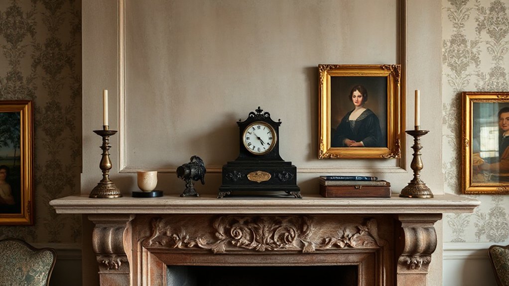
Symmetry offers a quiet, formal backbone to a mantel, especially in UK period homes where bay windows and hearths anchor the room. You’ll notice how balanced pairings frame central objects, creating a calm procession of details that reads as intentional restraint. As you plan, consider vertical and horizontal alignments: mantel height, art edges, and mirror crowns should line up, each element echoing the other across the axis. When you tilt toward asymmetry, introduce a deliberate focal point—perhaps a prominent portrait or a single, ornate clock—while keeping supporting items calmer and more uniform. Color schemes guide the eye; keep a restrained palette to preserve balance, then use one bold accent to draw attention to the focal point. Art placement matters: guarantee sightlines remain uninterrupted and proportionate.
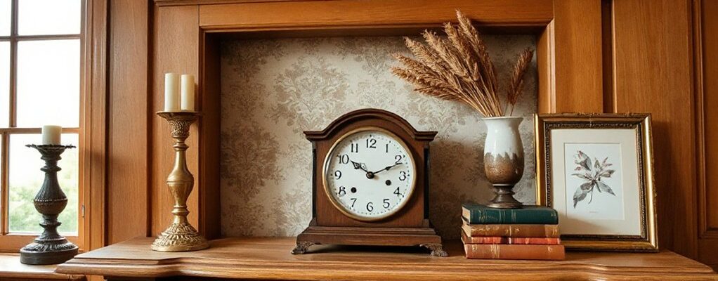
Select Warm, Minimal Accessories
You notice how warm, pared-back accessories glow when they catch the mantel’s light, avoiding clutter while keeping character. Choose light, curated pieces—think textured ceramics, bone china, or a slim brass clock—that add warmth without crowding the space. Each item should read as intentional detail, enhancing the period feel while staying quietly minimal.
Warmth With Minimalism
Warmth comes from restraint: select warm-toned wood, soft textiles, and a few well-placed objects that feel timeless rather than themed.
You observe how color coordination unfolds with quiet materials: a maple mantel, ochre accents, and charcoal shadows that don’t shout. Texture layering matters more than quantity, so you stack a linen throw, a wool blanket, and a velvet cushion with careful gaps to let light breathe. Each piece reads as deliberate, not decorative, a nod to period detail without nostalgia.
- Warm-toned wood as a base
- Soft textiles for depth
- A single sculptural object
- Subtle metallic accents
- Quiet, balanced color palette
Curated Light Accessories
Soft light finishes the mantel with a quiet glow, so select accessories that illuminate without shouting. You notice how carefully chosen pieces cast warm pools on brick or plaster, avoiding glare that competes with architectural details. Curated light accessories lean toward restraint: a single glass candleholder, a slim brass orb, or a muted ceramic lamp. Each element earns its place through proportionality, texture, and the way it catches dust motes in seasonal lighting. You evaluate contrasts: the softness of fabric lampshades against stone, the gleam of metal beside matte glaze, the way a muted hue preserves room tone. Seasonal lighting enhances depth without overpowering the mantle, while modern contrasts remain subtle and purposeful, guiding attention to history rather than novelty.
Practical Fit, Lighting, and Maintenance Tips
When fitting a mantelpiece in a UK period property, practical concerns begin with scale and finished detail: measure the opening, note the proportions of the room, and check that the mantel’s base sits flush with the wall to avoid gaps that collect dust. You’ll prioritize fit, lighting, and upkeep, observing how daylight and shade play across the surface and how the hearth aligns with existing flooring. Keep maintenance simple with durable finishes and accessible cleaning angles. Fireplace renovation and mantel décor trends inform your choices without dictating them.
- Assess wall texture and joint lines before fixing brackets
- Choose lighting that won’t glare or warp carved detailing
- Opt for heat-resistant finishes and easy-clean surfaces
- Plan cord and plug placements for modern devices
- Schedule seasonal dusting to preserve period character
Quick Styling Recipes by Era: Regency, Georgian, Victorian, Arts & Crafts
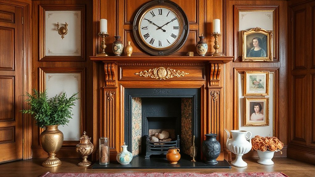
From Regency to Arts & Crafts, each era brings its own mantel cues, and you can spot them in scale, ornament, and finish. In Regency, you opt for restrained elegance: slim mantels, delicate plasterwork, and a light palette that lets a single clock or vase read as a focal point. Georgian displays symmetry, with balanced mirrors and urns set on a clean, refined plinth. Victorian leans into depth—bold projection, heavy Corinthian motifs, and warm timber that grounds busy vignettes. Arts & Crafts favors honesty of material—exposed oak, simple joinery, and handcrafted textiles. Quick styling works best with Historical restoration precision, then you layer contemporary contrasts—sleek metal accents, crisp white mats, and selective color pops for modern rooms.
Frequently Asked Questions
How Do I Adapt Period Mantels for Modern TVS or Tech?
You adapt period mantels by tucking the TV into a custom console or alcove, then layer with vintage accessories and contemporary artwork, disguising cords. You mount subtly, balance scale, and preserve character while adding modern tech functionality.
What Lighting Temperature Suits Each Era’s Mood?
Answer: You’ll want cooler, era-specific bulbs for early periods and warmer tones for later ones; the Lighting ambiance shifts with mood. Era specific bulbs subtly shape shadows, revealing details as you observe and adjust in suspense.
Can Conflicting Period Styles Coexist on a Single Mantel?
Yes, you can mix styles; aim for period harmony as the guiding rhythm and let deliberate style contrast stand out. You observe textures, lines, and scale, balancing eras with cohesive color, proportion, and thoughtful focal points.
How Do Heights Affect Mantel Styling in Small Rooms?
Mantel height should suit your room proportions, avoiding overpowering ceilings or dwarfing firesides. You’ll notice in small rooms that lower mantels feel cozier, while higher ones create breathing space; balance with scale, art, and period-aware detailing.
Which Sustainable Materials Work With Historic Finishes?
You should pick Eco friendly finishes and Reclaimed wood accents, since you want period-appropriate warmth without harming heritage. You observe subtle patinas, knotty textures, and color harmonies that respect historic finishes while lending modern, sustainable durability.
Conclusion
You’ll notice the mantelset speaks softly of its era: timber glow, stone honesty, brick warmth, all aged to perfection. Keep it balanced—symmetry where form demands it, or a single, quiet focal point when the room breathes more freely. Minimal accessories, touched with period-appropriate patina, let carving, moulding, and texture do the talking. Light thoughtfully, maintain regularly, and let every placement feel inevitable. Do this and your mantel becomes history you can live in—astonishingly, a heartbeat of the home.