A narrow hallway acts like a quiet stage for your art, forcing every choice to count. You’ll map layouts with paper templates, pick a cohesive palette, and choose frames that unify while letting variety breathe. Precision matters: measure for even gaps, plan a staggered rhythm, and test lighting so each piece shines. Ready to balance function and feeling, you’ll uncover the practical steps that keep the space open without compromising impact. The answers start with your first measured move.
Define the Look You Want for a Narrow Hallway
Start by choosing a unifying idea—color, material, or motif—that will tie a compact gallery together. You define the look by narrowing choices to a single purpose: what you want the hallway to communicate. Consider color schemes that anchor the space without overwhelming it, and align wall textures with your light levels and movement. Decide whether you prefer crisp, minimalist lines or a textural, tactile surface that adds interest as you walk by. Establish a mood—calm, bold, or contemplative—and map how each piece supports it. Prioritize scale, spacing, and alignment so the wall reads as a coherent collection, not a random assortment. Finally, test contrasts between frames, finishes, and mounts to preserve clarity and flow.
Choose a Cohesive Palette to Make the Hallway Feel Spacious
Choosing a cohesive palette for a narrow hallway starts with a core color that anchors the space and a limited set of supporting tones that reinforce it. You select a dominant shade, then pair it with two or three complementary hues that repeat through artwork, frames, and textiles. This restraint creates visual continuity, making the hall feel more expansive. Prioritize color coordination by assigning values—light for walls, slightly darker for accents, and a grounding base at floor level. Use pattern mixing sparingly, ensuring any motif echoes the core color or one supporting tone to avoid rhythm chaos. Test swatches along the length of the hall at different times of day to confirm perceived harmony. The result is calm, intentional, and spacious, not crowded.
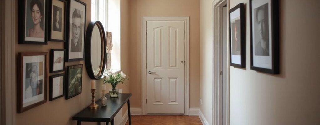
Select Frames That Unify, While Preserving Variety
Choose frames that share a common element—finish, profile, or matting—to create visual unity. Then vary size and shape dynamically to guide the eye and add interest without breaking the rhythm. This balance keeps the wall cohesive yet lively, even in a narrow hallway.
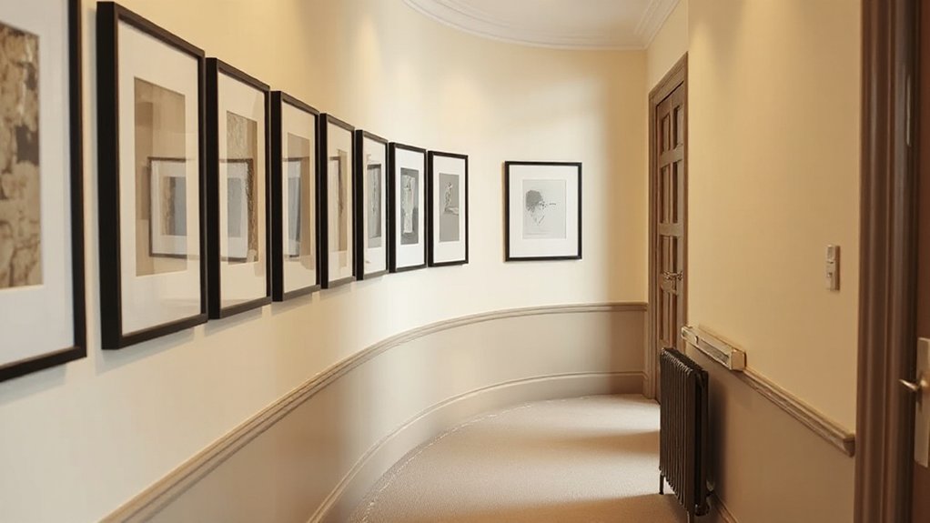
Unify With Consistent Frames
Using a consistent frame set unifies a gallery wall even when you mix different artworks, photos, or media. You curb visual chaos by selecting frames that share a shared silhouette, finish, or border width, establishing a discreet rhythm across the wall. Aim for color coordination—frame tones that echo or gently contrast the hallway palette—so individual pieces don’t compete for attention. Vary only the art within a uniform frame system to preserve continuity, not distraction. Consider wall textures; if you have a glossy finish, matte frames read more grounded, while rough textures pair well with slim profiles. Maintain even spacing and alignment, ensuring the arrangement breathes as a single installation. This approach balances variety with coherence, making the narrow corridor feel curated, calm, and intentional.
Vary Size And Shape Dynamically
Why settle for sameness when you can sculpt rhythm with varying sizes and shapes? You curate a dynamic gallery by mixing frames that unify, yet preserve variety. Start with a consistent neutral mat or border to anchor several outliers, then introduce one or two larger pieces to pull the eye along the corridor’s length. Group elements around a core color scheme, but vary frame profiles and orientation to suggest movement. Consider color schemes that echo your wall textures: matte black against a chalky plaster, or warm wood beside a gloss tile. Alternate tall and square shapes, leaning profiles, and floating coordinates to avoid stasis. Test spacing in small increments, and refine until the wall feels intentional, cohesive, and breathable.
Measure Precisely to Fit a Gallery That Feels Wide
You can make a narrow hallway feel wider by measuring once and matching the gallery layout to that precise width. Measure wall height and floor-to-ceiling clearances at several points to capture variance, then map a grid that reflects true distances. Place art placement decisions around a consistent vertical rhythm; align the midpoint of key pieces with a chosen wall height to create visual balance. Use a laser measure for accuracy, and double-check with a spirit level against the wall plane to avoid tilt illusion. Draft a minimalist frame set that respects margins, letting negative space do the widening. Mark positions on backing paper first, then transfer to the wall. This disciplined approach prevents misalignment and yields a cohesive, expansive gallery feel without crowding.
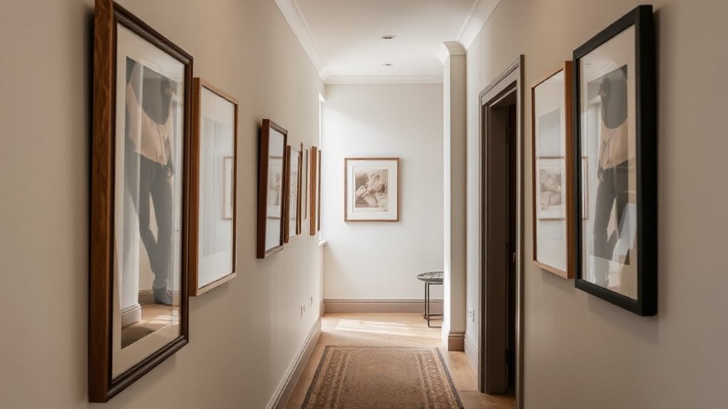
Plan a Staggered Layout to Maximise Width
A staggered layout can visually widen a narrow hallway by exploiting alternating vertical centers and varied piece sizes. You plan with intent, not impulse, aligning key anchors at different heights to create rhythmic movement. Begin by selecting a core trio of works with coordinated color tones, then mix smaller pieces to balance negative space without crowding. Use color coordination to tie disparate frames into a cohesive flow, avoiding jarring contrasts. Map a loose grid on the wall, marking centers at intervals that skew above and below eye level. Lighting placement matters: mount a discreet fixture that highlights each focal piece along the stagger, reducing glare in narrow sightlines. Leave deliberate gaps so the eye travels naturally, expanding perceived width while preserving a calm, deliberate gallery rhythm.
Mix Art Types Without Crowding the Wall
Mix styles with intention, so a piece from a bold portrait next to a minimalist print feels deliberate, not cluttered. Vary frame sizes to create visual rhythm while keeping a cohesive backbone—think alternating widths and consistent matting. Use smart spacing and a restrained color clock to balance variety without crowding the wall.
Mix Styles, Smartly
To mix art types without crowding the wall, group pieces by scale and mood rather than by medium. You’ll create visual harmony by pairing bold, larger shapes with quieter, smaller ones, and by aligning tonal ranges across media. Think in tiers: a singular focal work anchored by supporting pieces that echo color or silhouette. Use color coordination to tie disparate works together, not by matching subjects, but by repeating a shared hue or temperature across frames. Frame materials should echo each other, even if art types differ; consider matte black metal with wood accents to balance contemporary and traditional vibes. Avoid clutter by maintaining purposeful gaps and clean edges, letting negative space read as part of the composition. This approach yields a coherent, dynamic wall.
Vary Frame Sizes
Vary frame sizes to create rhythm without crowding the wall. You’ll balance smaller and larger frames to guide the eye along the hallway, avoiding a dense, flat surface. Start with a core grid of medium frames, then insert a few bold, tall shapes to punctuate pauses. Keep the spacing deliberate: aim for consistent gaps that channel momentum without overwhelm. When mixing art types, let color coordination anchor the display so disparate pieces feel intentional rather than chaotic. Choose frame materials that echo each other—wood with a matte finish across sizes often reads cohesive, while metal accents can add modern contrast without clashing. Test lighting angles on different depths; shallow profiles reduce visual clutter and preserve hallway clarity. Maintain a clear focal anchor to unify the ensemble.
Create Visual Rhythm
We can create visual rhythm by pairing art types with deliberate variation in scale and placement, so the eye moves smoothly along the Hallway. You mix photography, prints, and small sculpture with paintings at key intervals, preventing monotony without crowding the wall. Prioritize cohesion through a unifying color palette, then punctuate with accents that echo color psychology—warm tones to energize or cool tones to calm—while keeping contrast legible. Maintain deliberate spacing: align a dominant piece at eye level, flank with secondary works at slightly higher or lower planes, and use staggered verticals to guide movement. Consider wall texture as a design element; mount lighter pieces on smoother sections and heavier media on textured zones. Finally, document distances to preserve rhythm during updates and future additions.
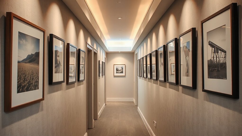
Install Lighting That Brightens Every Piece
A well-lit gallery wall becomes a living sequence of color and detail when you choose lighting that targets each piece. You map lighting placement to highlight texture, tone, and subject, not just fill. Use adjustable spotlights or wall-wash fixtures to follow the wall’s rhythm, keeping glare away from surfaces and your eye level at a comfortable stance. For each piece, aim a narrow beam at the center of interest, then blend with a softer fill to avoid harsh shadows. Consider bulb brightness carefully—opt a consistent color temperature and moderate lumens so contrasts reveal depth without clipping. Test with daylight nearby, then tweak angles until every frame reads clearly from the hallway’s midpoint. Precision in positioning yields balance, cohesion, and perceptual flow.
Establish a Practical Hanging Process for UK Walls
Hanging art in a UK hallway benefits from a repeatable, space-conscious process. Begin with a simple layout plan on the floor, using paper templates of each piece to test spacing before you touch walls. Mark the wall where hooks will sit, then verify vertical alignment with a spirit level. Choose a consistent anchor height, typically eye level for main pieces, and adjust, not the wall, if you need balance. Prepare your wall mounting hardware and tools in advance, keeping a calm workflow to minimize wall damage. Use hanging tools that suit weight and wall type, and label each template with its final position. Photograph the setup for future reference, and proceed item by item, maintaining a steady rhythm.
Troubleshoot Common Narrow-Hallway Gallery Issues
Common hallway constraints—such as tight width, uneven plaster, and variable lighting—often manifest as misaligned frames, warped layouts, or slipping templates. You troubleshoot by grouping with intent: place items on a blank floor plan, then test a scale that suits the space. Use a level to confirm vertical alignment and a tape measure to keep consistent gaps; tiny shifts compound quickly in narrow halls. For Abstract patterns, unify rhythm with consistent spacing and repeat motifs, adjusting placement before nailing. When handling Vintage collections, build a cohesive narrative by rotating pieces, balancing weight, and avoiding crowded clusters near doors. Stabilize frames with wall anchors appropriate to plaster, and label templates to deter rework. Solve issues by iterating, documenting outcomes, and refining the layout until it feels precise and calm.
Frequently Asked Questions
How Can I Avoid Glare on Glossy Frames in a Narrow Hallway?
To avoid glare on glossy frames, you adjust Lighting solutions by using diffused sources and matte finishes, and optimize Frame positioning to angle reflections away from your eye line. You’ll balance brightness, minimize hotspots, and preserve artwork’s clarity.
What Height Should I Hang Art to Suit Ceiling Height UK Doors?
Hang art at eye level for the average adult, about 150 cm, with ceiling height considerations in mind, then adjust for doors and corridor length; prioritize art placement that respects flow and proportion within the space.
Which Hanging Method Works Best on Plaster vs. Timber Walls?
Satire aside, you’ll find hanging on plaster uses picture-hangings with plaster anchors; timber walls prefer screws into studs. Framing techniques optimize when wall preparation is thorough, level, and dust-free, so you avoid crooked chaos and nail-pounding regret.
How Many Pieces Are Ideal for a 6-Foot Hallway Display?
For a 6-foot hallway, aim for 5–7 pieces in a cohesive Gallery arrangement, spaced evenly. You’ll balance scale and rhythm, then choose Frame selection that echoes shapes and tones, keeping lines clean and uncluttered.
How to Store and Protect Art During Hallway Renovations?
During renovations, imagine a fragile painting as a coiled spring—you must store it upright in a climate-controlled box. You’ll implement Art preservation, renovation safety practices, protect with archival materials, and label everything for quick, secure handling.
Conclusion
You can pull this off without fuss, but expect a few gentle detours. If a piece feels crowded, reposition it slightly and breathe—soft gaps make a hallway feel wider. When the light catches wrong, tweak the angle or swap bulbs; it’s not a failure, just a refinement. Stay disciplined with measurements, but allow a touch of whimsy in height or spacing. With thoughtful compromises, your gallery quietly elevates the space and invites lingering.