A quiet balcony fog rolls across your floor like a soft veil, revealing how period features can glow beside clean, modern lines. You’ll balance ornate details with restrained furniture, letting neutrals soak into carved moldings and fireplaces. Keep the rhythm steady—layer textures, test proportion, and let subtle vintage accents punctuate rather than predominate. The process will guide you toward spaces that feel lived-in yet current, and the next detail might be the key.
Why Blend Period Features With Modern Design
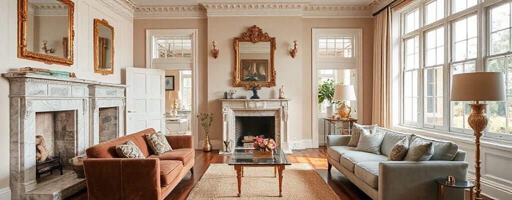
Blending period features with modern design creates spaces that feel both lived-in and fresh. You gain historical authenticity by honoring original details while you add clean lines and updated functions. This balance avoids sterile afterthoughts and keeps personality intact.
When you mix vintage charm with contemporary elements, you invite nostalgia without trapping yourself in the past. Focus on a few standout features—an ornate fireplace, a carved doorway, or a paired hardware set—and let them headline the room.
Then temper them with neutral palettes, streamlined furniture, and purposeful lighting to prevent clutter. The payoff is a versatile vibe that adapts to daily life and guests.
You’ll enjoy a cohesive aesthetic that feels curated, intentional, and timeless.
Build a Historical-Friendly Color Framework
You’ll anchor your palette in historical-color foundations, using authentic tones that whisper the era without overpowering modern lines.
Start with clear palette anchors for each era, then layer in contextual contrast to keep spaces lively rather than literal reworks.
This approach creates a cohesive framework where color history guides decisions while letting contemporary features speak.
Historical-Color Foundations
While color has evolved with trends, a historical-friendly framework begins by grounding palettes in the era’s materials, signals of social taste, and natural light responses. You’ll map undertones to authentic textures—brick, plaster, wood—so hues reflect their origin.
Favor restrained chroma, letting neutrals anchor brighter accents, then test against common daylight shifts to avoid mood swings between morning and dusk.
Tea ceremony influences might surface as quiet, ceremonial tones—warm browns, muted greens, soft reds—evoking ritual restraint without nostalgia overload.
Vintage signage nudges you toward retro warmth: faded yellows, brick-red, chalky blue, but applied sparingly to prevent lexical shouting across rooms.
Build contrast with clean lines and tactful gloss, ensuring color supports architectural features rather than competing with them.
The result feels cohesive, historically aware, and comfortably modern.
Palette Anchors For Era
Palette anchors set the mood by tying era-specific materials and light responses to targeted color families. You establish this framework by choosing colors that reflect genuine historical moments—warm terracotta tones for midcentury furnishings, muted pastels for Art Deco, or saturated jewel hues for Victorian-inspired rooms.
Your goal is consistency: anchor your palette with two to three core shades and a neutral support that won’t overwhelm the space. Color pairing becomes a deliberate tool, aligning wall hues with fabric, cabinetry, and hardware to create coherent narratives.
Then layer in subtle contrast through texture and finish to prevent flatness. Pattern mixing, when used sparingly, reinforces era without shouting. The result: a cohesive, modern interior that respects its history while feeling current.
Contextual Contrast Strategy
You’ll create balance by pairing antique elements with contemporary surfaces, letting tonal offsets define the dialogue. Use era contrast to highlight details without overwhelming them; choose muted, authentic neutrals for walls and fabrics, and reserve bold, clean lines for lighting and furniture silhouettes.
Introduce accent colors sparingly, drawing from period palettes but interpreting them with modern saturation. Maintain proportion: vintage anchors at 60%, contemporary touches at 40%. This approach fosters antique juxtaposition that feels intentional, not nostalgic.
You’ll achieve depth by layering warmth, texture, and shadow, crafting spaces that read as coherent yet refreshingly current.
Layer Textures to Add Depth and Cohesion
Layering textures adds depth and cohesion by inviting tactile contrast and visual nuance. You blend old and new by varying materials, weights, and finishes, so each surface reads distinct yet belongs to a single story.
Start with foundational textiles—rug, drapery, and upholstery—in complementary tones to establish rhythm without overpowering period details.
Textural layering builds micro-contrast: a tactile wool against a smooth velvet, a matte plaster wall beside a lacquered wood cabinet.
Introduce Pattern mixing carefully: repeat a geometric motif in a throw and a rug, then echo it in a narrow border on curtains.
Resist busy clashes; aim for a curated chorus rather than a crowd.
Let your textures evolve with light shifts and seasonal mood, preserving clarity, cohesion, and the room’s architectural voice.
Modernize Detailing: Furniture, Scale, and Layout
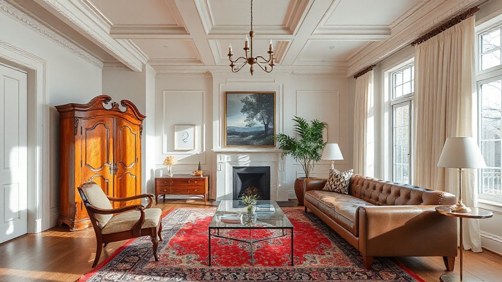
Modernizing detailing means rethinking furniture thumbsprints, scale, and layout so period features stay the hero while furniture supports them. You’ll balance form with function, selecting pieces that respect proportions and preserve sightlines to architectural accents.
Choose furniture with clean silhouettes or restrained ornamentation to avoid competing with antique features; this lets carved moldings, plasterwork, or timber details breathe. Prioritize scale that complements rooms rather than overwhelms them, and arrange layouts that promote flow, sightlines, and conversation without crowding key features.
Integrate antique upholstery and vintage hardware thoughtfully—let a chair finish echo a rail or leg detail, and mix metals to unify spaces. Keep proportions tight, textures considered, and avoid gimmicks; the result is cohesive, timeless, and distinctly modern.
Lighting Ideas That Unite Mixed-Era Spaces
Lighting is the hinge that can fuse period details with contemporary comfort, so think in layers that highlight character while guiding the eye.
You’ll blend eras by using mixed lighting that serves function and mood. Start with a neutral base—soft recessed or track lighting—to avoid competing with vintage features.
Introduce Vintage fixtures strategically, letting their silhouettes frame architectural details without overwhelming them. Balance with modern fixtures that deliver clean lines and dimmable control for ambience.
A statement chandeliers can crown a dining space or entry, but keep proportion in check to maintain harmony with original moldings.
Use warm, amber-toned bulbs to unite old and new textures. Aim for a cohesive glow rather than flashy contrasts, so each era feels intentional, not competing.
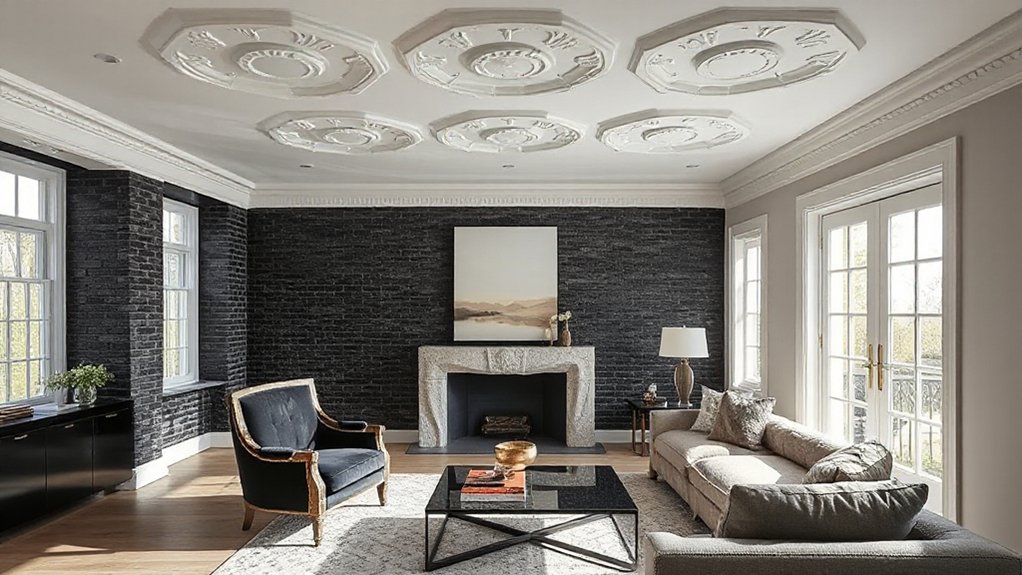
Finishes and Materials That Bridge Old and New
Finishes and materials act as the bridge between old and new, shaping how character and function meet in a single room. You’ll blend textures and surfaces to create continuity without erasing history.
Start with neutral foundations—plaster, limewash, or warm plaster walls—that whisper the past while letting modern pieces breathe. Pair vintage textiles with contemporary silhouettes to add warmth and a sense of history without heaviness.
Choose wood tones that read cohesive across eras, then punctuate with antique hardware on cabinets or lighting fixtures to cue craftsmanship. Matte finishes feel restorative; gloss accents draw the eye strategically.
Consider a restrained palette so one vintage element, like a rug or chair, anchors the room. Remember: restraint and intention keep old souls from overpowering new ambitions.
Room-by-Room Cues to Keep It Simple and Cohesive
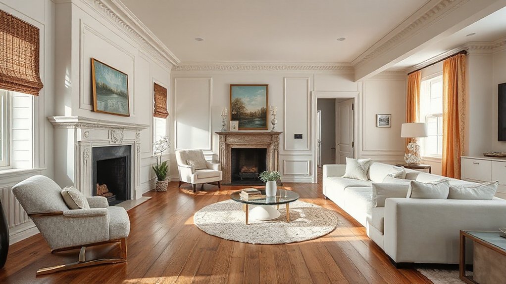
When you map Room Harmony Cues, you set a subtle rhythm that guides eyes and flow from room to room.
Balance Focal Feature Balance so your centerpiece feels intentional without shouting, anchoring each space with a shared moment.
Let a Cohesive Material Palette thread textures and tones across rooms, creating a calm, unified backdrop for period accents and modern touches.
Room Harmony Cues
Room harmony hinges on clear cues that guide the eye from room to room, so you establish a cohesive flow without shouting style. You align progressions by repeating subtle motifs and consistent scales across spaces, letting each room echo the previous without duplicating elements.
Use a restrained palette and a deliberate rhythm of textures to create quiet continuity. Antique accents and vintage motifs subtly surface in trim, hardware, or accents, signaling continuity without overwhelm.
Choose one unifying material—wood tone, metal finish, or pottery glaze—and carry it through doorways, rugs, and lighting, so the eye travels naturally.
Keep furniture silhouettes compatible in scale, avoiding overcrowded layouts. Small, deliberate changes—lighting warmth, curtain weight, rug placement—keep energy steady and progression calm.
Focal Feature Balance
If you’ve kept a quiet, cohesive rhythm across rooms, you can now balance each space around a deliberate focal feature rather than an across-the-board sameness. Establish a clear focal point in each room—perhaps a fireplace, an art wall, or an architectural cue—that guides furniture and lighting decisions.
Use visual hierarchy to prioritize the focal feature: scale, contrast, and placement should make it immediately read as the anchor. Around it, curate supporting elements that echo its tone without competing for attention.
Limit accents to two or three complementary hues or textures per room to preserve clarity. Maintain rhythm by repeating the focal strategy in adjacent spaces, then pivot subtly for variety.
The result: rooms that feel intentional, cohesive, and easy to navigate.
Cohesive Material Palette
A cohesive material palette ties rooms together by repeating a restrained suite of textures, finishes, and tones, even as you vary scale and placement. You’ll anchor each space with a core material—wood, stone, metal—then layer complementary surfaces to read as one story.
In living areas, mix matte woods with soft textiles and a subtle stone or plaster backdrop to avoid heaviness.
In kitchens and baths, keep cabinetry unified in a single finish, while introducing contrast through countertop textures and hardware.
Antique patterns or vintage accents should appear as intentional punctuation—a carved wall panel, a striped rug, or a ceramic tile—so they elevate, not overwhelm.
Maintain rhythm by mirroring pattern scale across rooms, ensuring cohesion without sameness.
Frequently Asked Questions
How Do You Balance Bold Period Details With Minimal Modern Furniture?
You balance bold period details with minimal furniture by letting ornate moldings shine and using restrained pieces. Emphasize contrast, curate vintage lighting thoughtfully, and keep color palettes simple to maintain a cohesive, elegant, timeless feel.
Can You Mix Multiple Historic Eras Without Confusion?
Mixing multiple historic eras is doable without confusion if you anchor each space with a clear rhythm, like a concert where distinct instruments harmonize. Prioritize Historical accuracy and Period restoration to guide cohesive, deliberate, visually striking decisions.
What Budget Tips Prevent Overloading a Space With Antiques?
You curb antique clutter by prioritizing essential pieces and investing in high-quality vintage accessories. Set a cohesive palette, limit periods to one or two accents, and curate, not accumulate, using careful display to prevent budget-draining overstuff.
Which Fabrics Age Gracefully in High-Traffic Rooms?
Antique durability shines; you choose tight-weave upholstery and leather that age gracefully, and you’ll spot-proof textures. You’ll prioritize fabric maintenance, spill protocols, and calm colors to keep high-traffic rooms welcoming, resilient, and beautifully lived-in.
How to Retrofit Period Features for Smart-Home Technology?
You retrofit period features by planning discreet wiring and modular controls, enabling smart integration without visible clutter. Prioritize period restoration basics first, then seamless tech upgrades, and maintain authentic finishes while you modernize the home’s intelligence.
Conclusion
Blending period features with modern design isn’t about replication—it’s about dialogue. You mix the old with the new to create spaces that feel timeless, not nostalgic or sterile. Prioritize a cohesive color framework, layer textures, and balance scale so vintage details shine without overpowering. Think of your room as a well-tuned instrument, where each note—furniture, lighting, finishes—harmonizes. When done right, the result is chic, welcoming, and effortlessly us—like a well-loved novel with a fresh edit.