North-facing light can wash colors cooler and dingier, so you’ll want warm whites, soft neutrals, and gentle blues or greens that reflect light without glare. Aim for satin or eggshell finishes to boost warmth, layer textures, and use reflective surfaces to bounce what you have, then pair these choices with lighting that complements the undertones. It’s a practical path to an airy, balanced space, but there’s more to fine‑tuning than you might expect—let’s explore what to try next.
Key Takeaways
- Use warm white and soft off-white tones with reflective satin or eggshell finishes to brighten north-facing rooms without washing out color.
- Choose mid-to-light luminance neutrals with warm undertones to read sunny and calm under cool north light.
- Test swatches on multiple walls at different times of day to verify undertone consistency and brightness.
- Incorporate subtle blues and greens with light-reflective qualities to reduce glare and create an even, uplifting glow.
- Pair colors with layered textures, matte woods, and daylight-optimized lighting to maximize perceived brightness and openness.
Why North Light Dims Colors and What to Aim For
North-facing light is cooler and steadier, which makes colors look dimmer than they do in sunlit rooms. You’ll notice your walls seem cooler, less saturated, and sometimes more blue or gray than expected. This is the result of north light’s color temperature and direction, which alter how you perceive hue and brightness.
To counter this, identify north light challenges early: you’ll see color shifts at different times of day and under varying weather. Your goal is to maximize perceived brightness without washing out tone.
Choose paints with true-to-life undertones and a slightly higher lightness level than you’d choose in sunny spaces. Test samples on multiple walls, observe under daylight and artificial light, and adjust to preserve color perception while maintaining warmth and clarity.
A Quick Framework: Brightness, Undertones, and Finishes
Now that you know north light thwarts color warmth, use a simple framework to lock in brightness without losing tonal depth. A quick approach is to balance brightness, undertones, and finishes in every choice.
Start with brightness by selecting mid-to-light luminances that read clearly in your space, then test swatches in daylight and after artificial lighting.
Next, examine undertones: cooler neutrals lean blue, warmer hues drift toward beige or sage; confirm undertones align with furniture and flooring.
Finally, choose finishes that sustain presence without glare: eggshell or satin offer depth and durability, while matte may mute contrast.
Consider color psychology: softer tones feel calmer, bolder ones energize.
Remember paint durability matters for north-facing walls exposed to indirect sun, so choose high-quality, stable pigments.
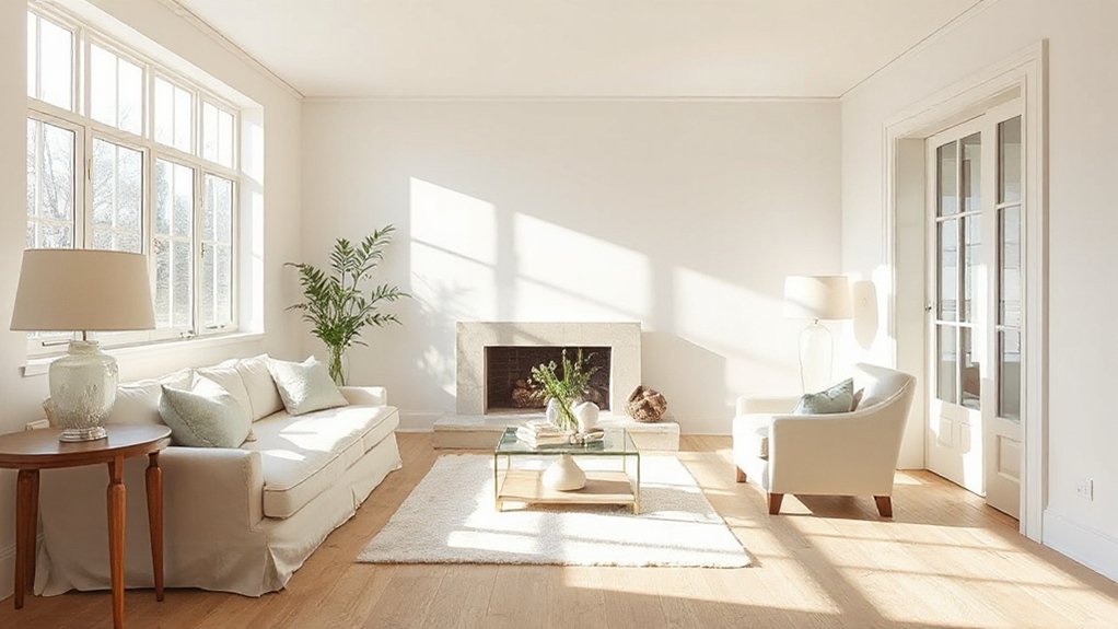
White and Off-White Picks That Stay Warm
Start with warm white tones that read cozy in north-facing light, and pair them with soft off-whites to keep rooms airy without washing out.
Consider finishes that reflect rather than absorb, like satin or eggshell, to maximize subtle warmth.
I’ll walk you through practical picks that stay bright without feeling cold, guiding you toward a cohesive, sun-friendly palette.
Warm White Tones
If you want warmth without yellowing a north-facing room, choose white or near-white paints with warm undertones—think creamy beige, soft ivory, or eggshell white.
Warm white tones brighten without tinting walls too strongly, and they read differently under natural vs. artificial light, so test swatches in your space.
Favor paints with subtle underlying warmth rather than stark bright whites, which can feel clinical.
For color psychology, warm whites can foster coziness, approachability, and perceived snugness, helping a space feel larger yet inviting.
In practice, use paint application techniques that maximize depth: apply a flat finish on tall walls to minimize glare, then topcoat with a satin or eggshell for durability and gentle sheen.
Avoid heavy contrast; keep trims softly tinted to preserve cohesion.
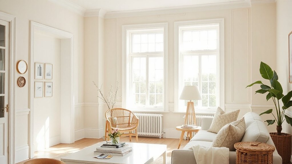
Soft Off-Whites Palette
Soft off-whites strike a balance between warmth and brightness, giving north-facing rooms a welcoming glow without leaning into yellow.
In this palette, you’ll find whites and warm-leaning off-whites that maintain clarity under cool light. Choose hues with subtle undertones—creamy, eggshell, barely tinted beiges—that prevent gray cast while still feeling fresh.
Color psychology guides you: warmer neutrals can comfort and invite conversation without overpowering accessories. When selecting, test three to five samples on different walls and in various lighting, noting how they read from morning to dusk.
Paint application techniques matter: cut in at corners, roll in even coats, and maintain a dry edge for smooth, uniform coverage. Lock in color with a high-quality finish to preserve warmth across the room.
Light-Reflecting Finishes
In practice, test swatches in daylight and lamp light to confirm true color and reflected glow. Color psychology matters: cooler whites can feel clinical, while creamy tones cue coziness without dulling brightness.
For paint durability, pick products with good washability and stain resistance, especially near high-traffic zones. Pair these shades with natural textures and metallic accents to deepen warmth while preserving luminance in every corner.
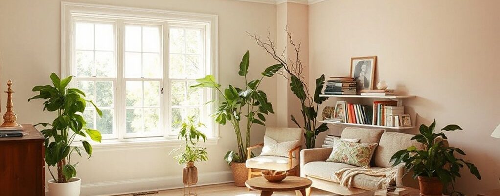
Soft Neutrals That Read Sunny in North Light
North-facing light can turn soft neutrals sunny without yellowing, so pick warm undertones that boost brightness while staying calm.
See how these neutrals read differently in shade versus sun—they should feel airy, not washed out.
Use this trio to map how North light shifts tone from morning to afternoon, and test on your walls before committing.
Soft Neutrals That Shine
If your north-facing room lacks warmth, soft neutrals can brighten it without feeling chilly. You’ll want shades that read sunny, not dull, so choose balanced undertones—warm beige, creamy gray, and soft greige—that reflect light while maintaining depth. In practice, test swatches in north light at multiple times of day to confirm their glow.
Consider how color psychology shapes mood: warm neutrals foster comfort, while cooler tints prevent over-washout. Pair these tones with white trim or low-contrast cabinetry to preserve luminosity. Keep surfaces matte or eggshell to reduce glare.
This approach aligns with interior design trends favoring versatile, timeless palettes that work across spaces. Use these neutrals as a dependable base for accent colors, textiles, and art.
North-Facing Light Qualities
Soft neutrals can read sunny in north light when you pick undertones that warm rather than wash out. In north-facing rooms, it’s all about how daylight shifts color perception, not ran-of-the-mill shade choice.
Choose paints with subtle warmth—tiny amounts of yellow, peach, or creamy undertones—that prevent grayscale, flat tones. You’ll notice colors lean toward pale warmth rather than cool gray, preserving brightness without sacrificing depth.
Test samples at different times of day to gauge how north light shifts hues, especially on walls and trim. Opt for low-sheen finishes to minimize glare while preserving soft luminosity.
Balance your palette with a slightly warmed white or beige near windows, ensuring the room reads open, inviting, and visually consistent in varying light. north light, color perception.
Sunny Read in Shade
Sunny reads in shade when you want soft neutrals to feel bright in north light. You’ll choose easy, breathable tones that reflect subtle warmth without shifting into yellow. Think soft creams and greiges rather than stark whites; they read sunny even when the sun hides.
In practice, test pigments at multiple times of day and on different walls to confirm consistency. A sunlit garden view or a window seat can help balance the palette, especially when paired with natural textures like linen, jute, and unbleached timber.
For coastal decor, lean into cool undertones slightly to avoid drifting cold. Use a matte or eggshell finish for depth, and reserve brighter accents for trim or textiles to preserve calm, sunlit softness.
Subtle Blues and Greens to Brighten Without Glare
Subtle blues and greens can brighten a north-facing room without glare by introducing cool, light-reflective undertones that don’t shout color. You’ll notice how these hues soften shadows and create a calm, even glow, ideal for spaces that lack direct sun.
Choose subtle color shifts rather than loud contrasts, so the brightness feels natural and steady. Pair pale blues with soft greens to form mood boosting palettes that read fresh without feeling clinical.
In practice, test swatches on multiple walls at different times of day, ensuring the undertone remains cool under varying light. Opt for low-saturation tones with ample white in trim or furnishings to maximize luminous balance.
This approach keeps your room feeling open, inviting, and serene.
Undertones and Finishes That Maximize Brightness
Even undertones and finishes can dramatically boost brightness in a north-facing room when chosen with intent. You’ll want undertones that read warm or neutral under cool daylight, avoiding pinky or muddy shifts that dampen light.
Opt for flat or eggshell sheens on walls to bounce light without glare, and reserve satin or semi-gloss for trims to catch reflections subtly.
For undertones, lean toward warm yellows, creamy beiges, or pale neutrals that lean toward warm gray—these counteract the blue cast of north light.
Consider color psychology and cultural influences when selecting hues, favoring tones that evoke openness, calm, and optimism.
Test samples at different times of day to confirm brightness consistency, and document how each shade performs under your room’s specific light conditions.
Pairing Colors With Furniture and Textiles for Depth
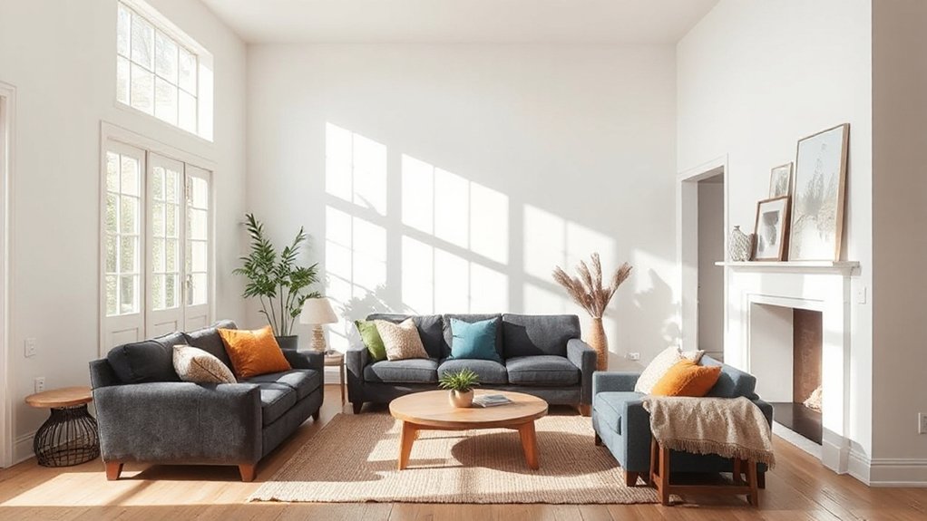
To add depth, pair your brighter wall colors with furniture and textiles that ground the space without competing with the light. Choose furniture textures that anchor the room—think matte wood, brushed metal, or leather—so your walls don’t feel exposed.
If you’re using pale or saturated greens, blues, or yellows, balance with midtone upholstery and solid, timeless silhouettes. Textile patterns should add interest without shouting; opt for restrained plaids, subtle stripes, or organic motifs in cohesive pigments.
Layer surfaces at different heights: a low-slung sofa, a textured rug, and a glossy coffee table create depth while preserving brightness. Avoid busy combinations; let one dominant textile pattern carry the focal point.
Consistency in color family reinforces harmony and heightens perceived room light.
Testing Colors and Optimizing With Lighting and Samples
Testing colors on your walls and samples is your fast track to confidence. You’ll test swatches in multiple lighting moments—morning, noon, and after sunset—to reveal true undertones. Track color psychology by noting how each hue affects mood, brightness, and perceived room size; you’ll see subtle shifts as light changes.
Use large samples on generous wall patches rather than tiny chips, so you witness real interaction with your space. Optimize with lighting by pairing paints with daylight-optimized bulbs and dimmable fixtures to control warmth.
Consider paint durability in high-traffic zones; choose washable finishes like satin or eggshell for north-facing rooms prone to dampness or fingerprinting.
Record observations, then compare to your original goals to finalize confidently.
Frequently Asked Questions
How Does Wall Texture Affect Perceived Brightness in North Light?
Wall texture does affect perceived brightness in north light: smoother surfaces reflect more light, while heavier textures absorb and scatter it, softening contrast.
Your wall finish matters most when you choose light colors or white, because a high-gloss or eggshell finish can bounce subtle daylight further.
Texture influence becomes practical in dim rooms—opt for finer textures and light, reflective paints to maximize the limited North light.
Do Ceiling Colors Influence Room Brightness in North-Facing Spaces?
Ceiling colors do influence brightness in north-facing spaces. You’ll notice ceiling reflection can boost perceived light by bouncing up to 60% more ambient glow around the room when you choose a light, cool tone.
Use color coordination between ceiling and walls to avoid dull, boxed-in effects. Opt for a slightly lighter shade than your walls, and keep finishes matte to prevent glare while maximizing reflected light.
Can Lighting Temperature Alter Color Brightness Impact Over Time?
Yes, lighting temperature can alter color brightness impact over time. You’ll notice cool temperatures (bluish) leaner whites read brighter initially, but warmer temps (yellowish) shift perception and soften contrast as days pass.
Pay attention to color temperature and light reflection: you’ll get more accurate brightness when you mix sources, use evidence-backed temperatures, and position lights to evenly bounce off walls.
Regularly reassess with real-life tests to maintain consistent brightness in your space.
Are Brightness-Boosting Paints Different for Small Rooms Versus Large Rooms?
Yes, brightness-boosting paints differ for small rooms versus large rooms.
In small spaces, favor higher reflectivity and lighter color temperature with a satin or eggshell paint finish to avoid glare while maximizing light.
Large rooms can tolerate slightly warmer tones and matte finishes to soften reflections.
Consider consistent Color temperature across walls, ceilings, and trim, and test samples under your lighting.
Paint finish and color temperature together determine perceived brightness and ambience.
Should I Test Colors in Multiple Times of Day for Accuracy?
Yes, you should test colors at multiple times of day for accuracy. Light shifts reveal color fading differently and help you pick true tones.
Use swatches on the wall and observe under morning, noon, and dusk. This practice also informs paint durability you’ll actually notice in real lighting.
Be mindful of color fading near windows and guarantee you choose a finish that stays consistent. You’ll feel more confident choosing a durable, true color.
Conclusion
You’ll feel the room wake, like morning tide meeting shore, when you pick warmth over starkness. Think of undertones as sails catching light: whites with satin glow, soft neutrals, and a whisper of blue or green that won’t glare. Test in daylight, then at night, adjusting finishes and textures as you go. With layered brightness and mindful pairing, north-facing spaces transform—from cool, dim corridors to inviting, sun-kissed rooms that still breathe. The rhythm anchors your choices.