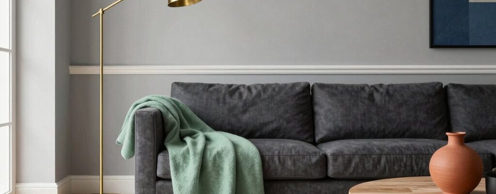
Did you know neutral tones help homes photograph 60% better in listings? You’ll want a palette that feels timeless yet fresh, so you choose soft grays, warm beiges, and creamy whites as your base. Add subtle accents—muted blues, sage greens, or moody charcoal—to create depth without overwhelming buyers. Pair natural textures with warm woods and layered fabrics, then use color strategically to keep spaces inviting and versatile. Curious how to balance it all for maximum impact?
Timeless Neutrals That Ground Modern Spaces
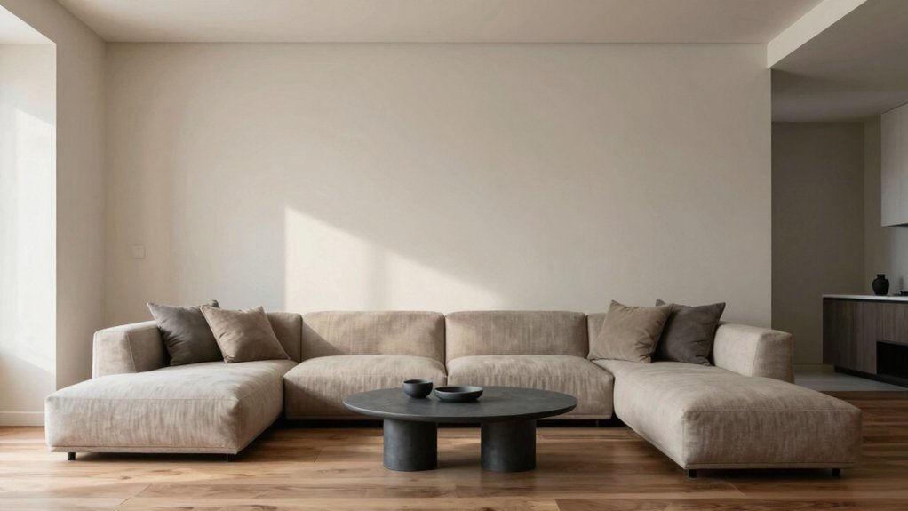
Neutral tones form the backbone of a modern staging strategy, and timeless neutrals give you a reliable, versatile foundation. You’ll feel grounded as you choose shades that recede yet elevate, letting architectural features shine.
Timeless neutrals don’t compete with artwork or furniture; they support, flex, and adapt as needs shift. When you lean into warm beiges, cool taupes, or creamy whites, you create spaces that read effortless and inviting.
To add personality without overpowering the scene, weave in vintage patterns via textiles or subtle wallpapers, carefully balancing them with solid neutrals.
For focal points, consider bold accent walls that anchor conversations without overwhelming the room’s harmony.
Together, these choices yield spaces that look current, commercial-ready, and genuinely livable.
Soft Grays and Greiges for Versatile Backdrops
Soft grays and greiges strike the perfect balance between warmth and crispness, creating versatile backdrops that adapt as quickly as your staging needs evolve. You’ll see rooms feel more expansive and calm, inviting viewers to imagine their own styles without distraction.
Choose shades with nuance—undertones that read modern yet approachable—so you maintain cohesion from living areas to kitchens. This approach supports paint color psychology, guiding emotional responses toward comfort and focus.
When selecting, test in multiple lighting conditions to prevent sudden shifts that steal attention from the decor. Also consider color accessibility standards, ensuring sufficient contrast for readability and navigation in photos and tours.
With mindful choices, your spaces stay elegant, resilient, and easy to customize for any client or listing.
Warm Wedges: Beige, Taupe, and Sand Tones
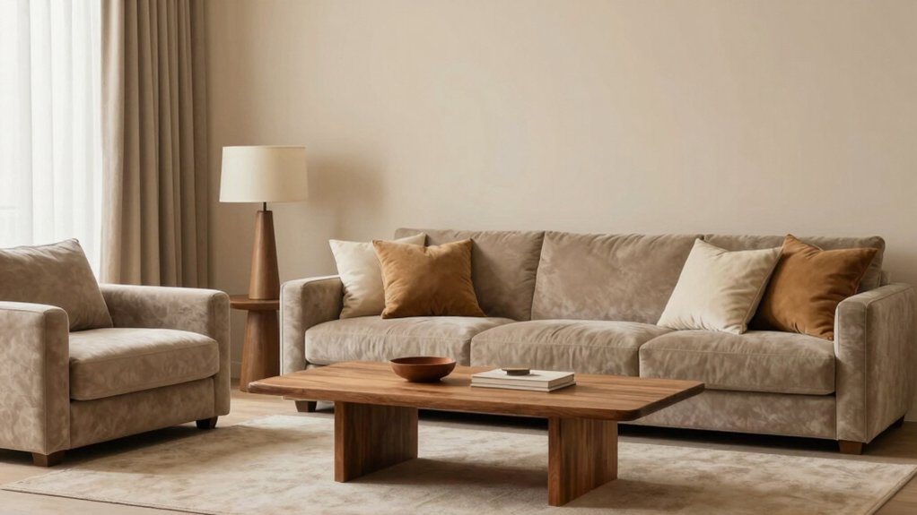
Warm wedges create inviting warmth without overpowering other design elements, blending beige, taupe, and sand tones to anchor a space with subtle sophistication. You’ll feel grounded without dulling personality, as these hues support furniture and art rather than compete with them.
In color psychology terms, they convey calm, stability, and approachability, helping clients feel instantly at ease.
Choose paint finish choices that suit your lighting: eggshell or matte for soft, intimate rooms, satin for higher-traffic areas, and semi-gloss on trim to define edges without glare.
Beige, taupe, and sand tones adapt across styles, from contemporary to rustic, so you preserve flexibility as trends shift.
Use them as a neutral stage, then layer with accent colors strategically to guide flow and mood.
Elegant Whites With Subtle Undertones
Elegant whites with subtle undertones set the stage for crisp, versatile spaces that feel fresh yet warm. You’ll explore how subtle undertone pairing influences mood, while maintaining white’s brightness without harsh glare.
This approach delivers warmth without yellowing, ensuring your staging looks polished across lighting and fabrics.
Subtle Undertone Pairing
Subtle undertones can make an all-white palette feel curated rather than clinical; choosing colors with gentle, compatible undertones keeps spaces inviting and cohesive. You pair whites with warm, cool, or muted tints to shape mood without overpowering light.
Think alabaster with a whisper of cream for warmth, or a cool, minty white for modern edge. The key is balance: undertones should harmonize across walls, trim, and furnishings to prevent jarring shifts.
Consider color psychology: subtle yellows can cozy a breakfast nook, while soft grays convey calm in living zones. Cultural influences matter too; traditions around hue can guide tasteful accents and fabrics.
You’ll create depth and cohesion by testing swatches together, ensuring gradations feel deliberate and refined rather than accidental.
Crisp White Versatility
Crisp white surfaces offer a clean canvas that feels fresh yet refined, especially when you thread in subtle undertones. You’ll use white as your architectural backbone, then let contrast and texture carry the drama.
Bold accent walls create focal points without overpowering, letting color pops or art breathe in a controlled, high-end way. Metallic finishes atop trim, fixtures, or hardware introduce a refined gleam that elevates the space without shouting.
This versatility keeps rooms cohesive, even as you switch palettes season to season. By pairing whites with restrained warmth, you maintain clarity and depth, so buyers see space, light, and possibility.
The result is an elegant, modern aesthetic that photographs well, reads confident to clients, and adapts to diverse design preferences.
Warmth Without Yellowing
Warm white tones can feel inviting without yellowing, thanks to carefully chosen undertones that read warm but stay true over time. You’ll achieve that balance by selecting whites with subtle beige, ivory, or alabaster notes, not stark blue or green casts. This approach keeps rooms bright yet cozy, perfect for everyday living and resale confidence.
When you pair these elegant whites with vintage patterns, you add character without overpowering the space, preserving a timeless feel. Use them as a backdrop to highlight architectural details, trim, and classic furnishings.
For drama, introduce bold accent walls in deeper complementary hues, ensuring contrast remains refined rather than loud. The result is warmth with longevity, where your design choices read sophisticated, not dated. Your staging stays fresh, inviting, and confidently resilient.
Moody Accents: Charcoal and Deep Slate
Charcoal and deep slate set a moody foundation that sharpens contrast without overpowering your space. You’ll use moodier charcoal hues as anchors and pair them with lighter tones to keep rooms inviting and balanced.
This approach creates bold, sophisticated accents that feel modern yet approachable.
Mood-ier Charcoal Hues
When you lean into moodier charcoal and deep slate tones, you create a sophisticated backdrop that heightens focal points and elevates natural light. Mood-ier charcoal hues offer contrast without heaviness, so rooms feel grounded yet breathable.
You’ll discover these shades pair best with warm textures—cognac leather, brushed metals, and soft boucle—that keep spaces inviting, not austere. Use artificial lighting to sculpt ambience: layered layers of task, ambient, and accent lighting ensure depth and flexibility for activities from coffee chats to focused work.
In terms of furniture placement, let sleek silhouette pieces anchor a room’s anchor walls while lighter, textured accents float nearby to preserve balance. These colors support clean sightlines, momentary drama, and a timeless feel that clients perceive as intentional and refined.
Deep Slate Accents
Deep slate accents provide a refined counterpoint to lighter surfaces, grounding rooms with modern seriousness while keeping spaces inviting. You’ll notice how charcoal and deep slate temper bold furniture, letting textures—wood, metal, fabric—shine without competing for attention.
This palette works with complementary color schemes that range from warm taupe to coolest blues, giving you flexibility as projects evolve. Use deep slate as a grounding base and add lighter neutrals or soft whites to maintain airiness.
Accent wall ideas thrive here: one statement wall in deep slate can anchor a seating area, while a tonal trio of panels adds depth without heaviness. Pair with metallic accents for modern polish, or warm wood tones for coziness.
Your clients gain sophistication, clarity, and room to grow.
Subtle Blues and Greens to Calm Rooms
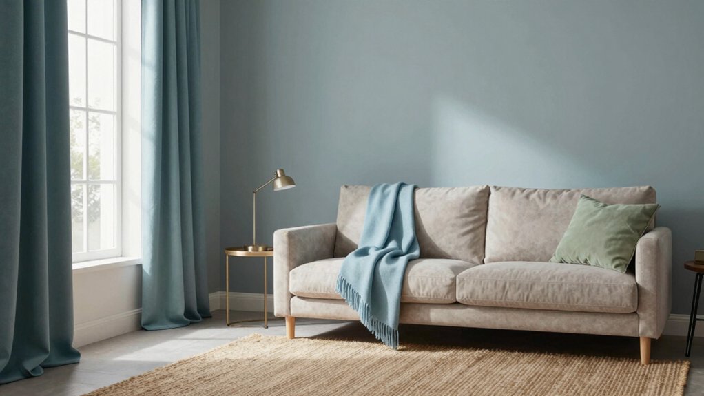
Blues and greens offer a calming foundation for modern staging, and subtle shades work wonders without overpowering a space. You’ll feel calmer with soft blues on walls or textiles, paired with sage greens in accents that don’t shout.
Use mineral palettes and airy neutrals to keep rooms open, bright, and approachable. You’re aiming for balance: serenity without blandness, depth without heaviness.
Integrate botanical prints to introduce nature’s rhythm without overwhelming the eye, and choose fabrics with matte finishes to maintain a soothing vibe.
Metallic accents—think brushed brass or satin nickel—provide just enough polish to highlight architectural lines.
Keep proportion thoughtful: small doses of color, bigger swathes of light, and a cohesive whole that appeals to buyers and clients alike.
Warm Woods and Natural Textures for Depth
Warm woods and natural textures bring immediate depth to modern staging, grounding airy spaces with tactile warmth. You’ll notice that warm tones in furniture and flooring create an inviting anchor, while raw textures add interest without clutter.
Lean into interior lighting to highlight grain, knots, and subtle sheens, which makes the space feel crafted rather than staged. Choose furniture textures that contrast smooth surfaces with woven, cork, or linen accents to build layers you can actually touch.
Keep the palette grounded with caramel, walnut, or ash, then introduce lighter textiles to prevent heaviness. This approach supports visual hierarchy, guiding the eye through seating groups and focal points.
Depth emerges through material honesty, balanced by careful scale, rhythm, and purposeful lighting choices.
Color Pairing Techniques for Buyer-Friendliness
Color pairing for buyer-friendliness isn’t about chasing trends; it’s about guiding buyers with clear, confident palettes. You’ll combine neutrals with subtle accents to create spaces that feel open and inviting, not overwhelmed.
Use color psychology to spark the right mood: serene bedrooms with cool tones, energizing kitchens with warm neutrals, and living areas that balance both.
Prioritize color durability; choose paints and fabrics that resist fading under daylight and traffic, preserving the home’s appeal.
Limit the palette to three core hues plus one accent for cohesion and easy buyer visualization.
Test contrasts so entryways feel welcoming and corridors stay fluid.
Document the rationale: how each choice supports scale, lighting, and flow.
When buyers see confident, simple guidance, your listing gains credibility and immediacy.